Overview
In this project, I enhanced Find My, Apple’s built-in location-tracking application.
Through personal experience and research, I discovered that many iPhone users rely on third-party tracking apps such as Life360 instead of Find My, despite already being in the Apple ecosystem. I wanted to understand why users preferred external apps and whether Find My could evolve to meet those expectations.
Motivated by this gap, I initiated a research-driven redesign to enhance safety features, increase user control, and reduce reliance on paid third-party tracking apps.
This case study walks through my research process, feature evaluation framework, design decisions, and user feedback.
Apple's Find My – Current Experience (2026)
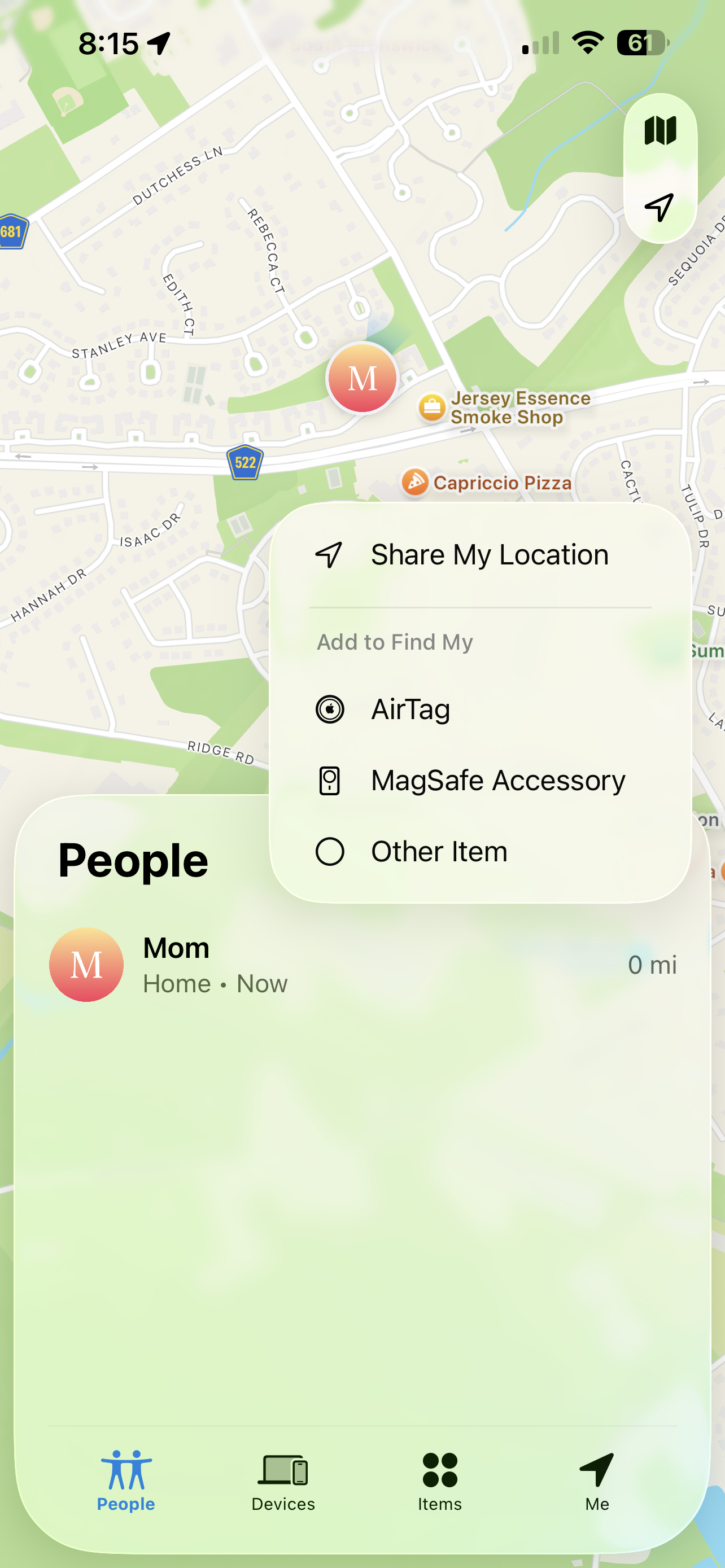
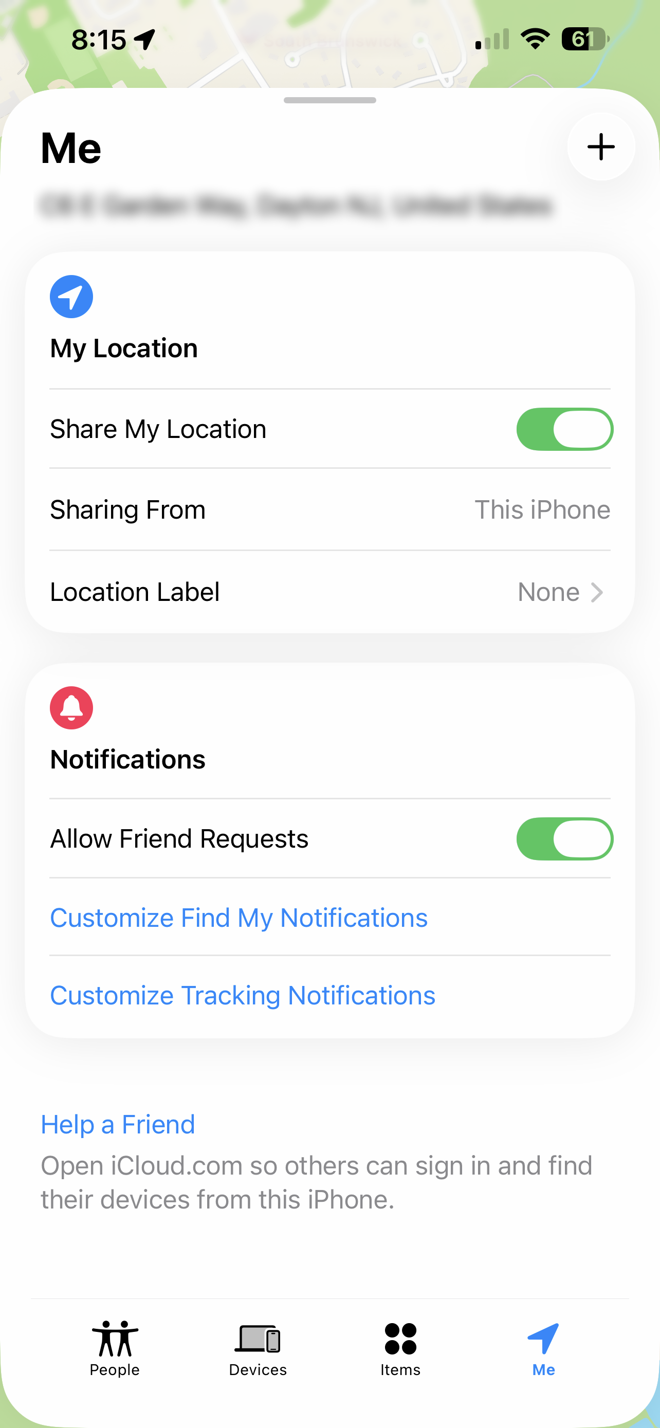
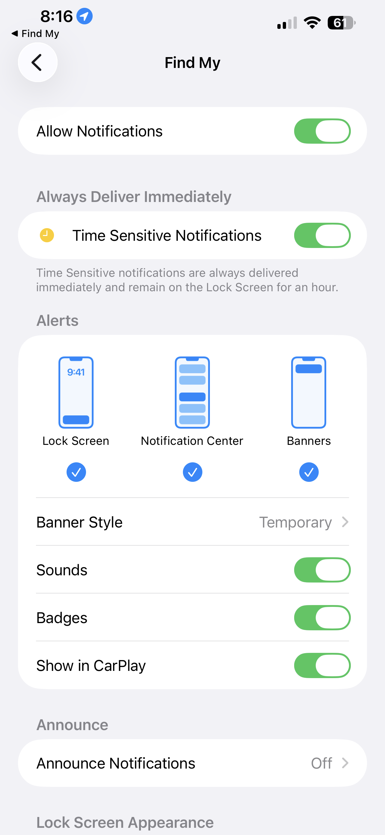
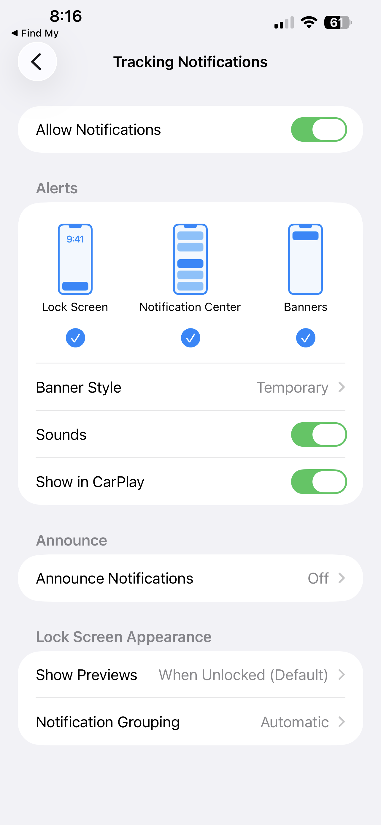
Screens from Apple’s Find My app (2026). Used for reference and analysis in this case study.
User Research
Research Goal
Research Method
To understand:
-
Why iPhone users prefer third-party tracking apps
-
What features they value most
-
What Find My is currently lacking
-
Whether users would switch if improvements were made
I conducted:
-
Competitor analysis of similar products
-
Interviews with iPhone users who actively use third party tracking apps
-
Feature analysis of the new features to be implemented
Competitor Analysis
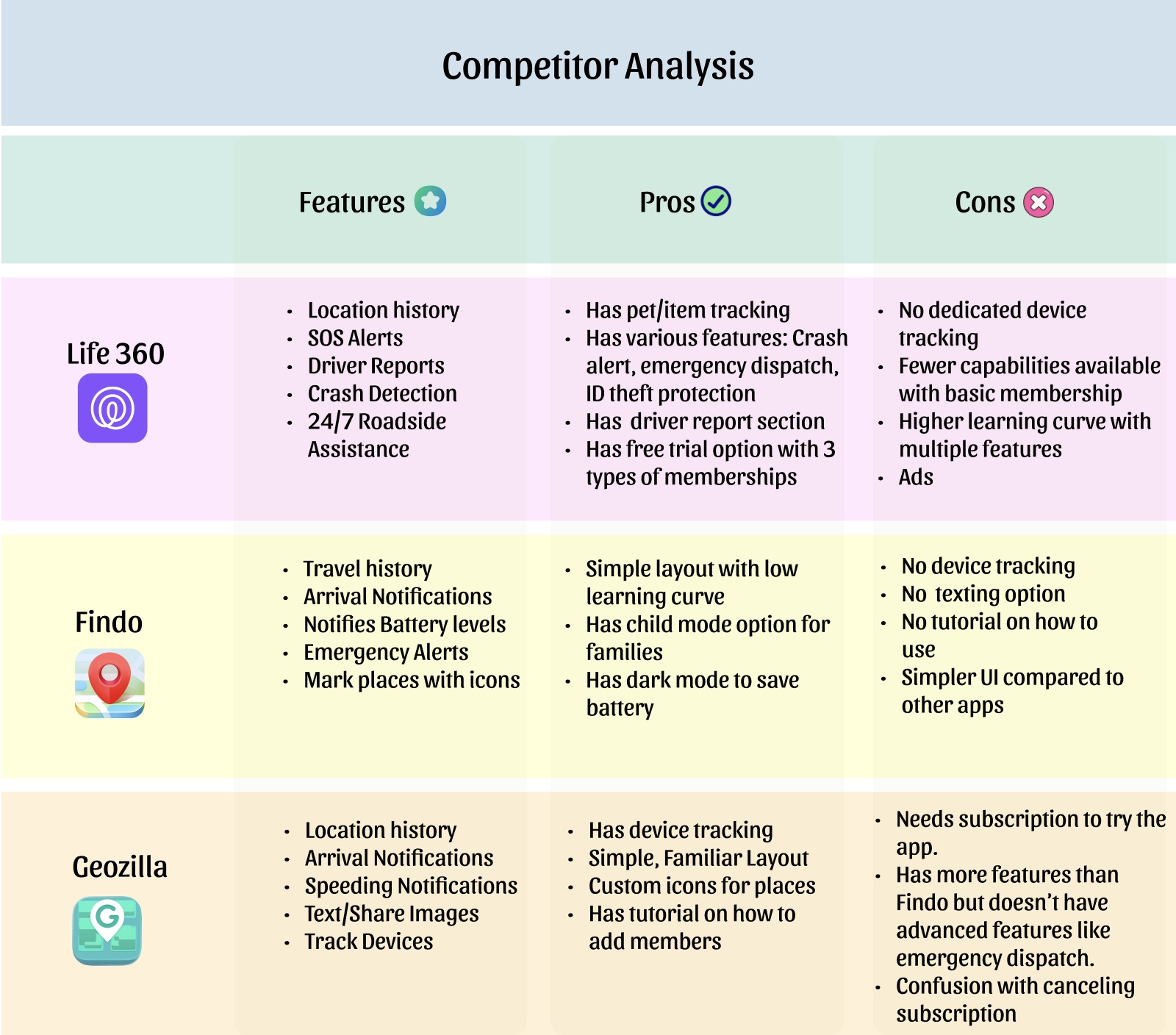
-
Compared leading location-tracking apps to understand their feature offerings.
-
Identified that safety features like speed alerts, SOS, and location history are major differentiators.
-
Noticed that most advanced features are locked behind subscriptions.
-
Observed trade-offs such as ads, complex memberships, and learning curve.
-
Found opportunity to combine strong safety tools with a simpler, built-in Apple experience.
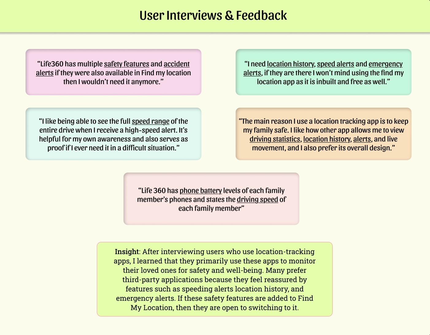
User Interviews
-
Spoke with iPhone users who rely on third-party tracking apps.
-
Users prioritize safety and peace of mind.
-
Features like speed alerts, location history, emergency notifications, and battery levels are highly valued.
-
Many users said they would switch to Find My if these features were available.
-
Clear opportunity to improve safety features within Apple’s built-in ecosystem.
Features Analysis
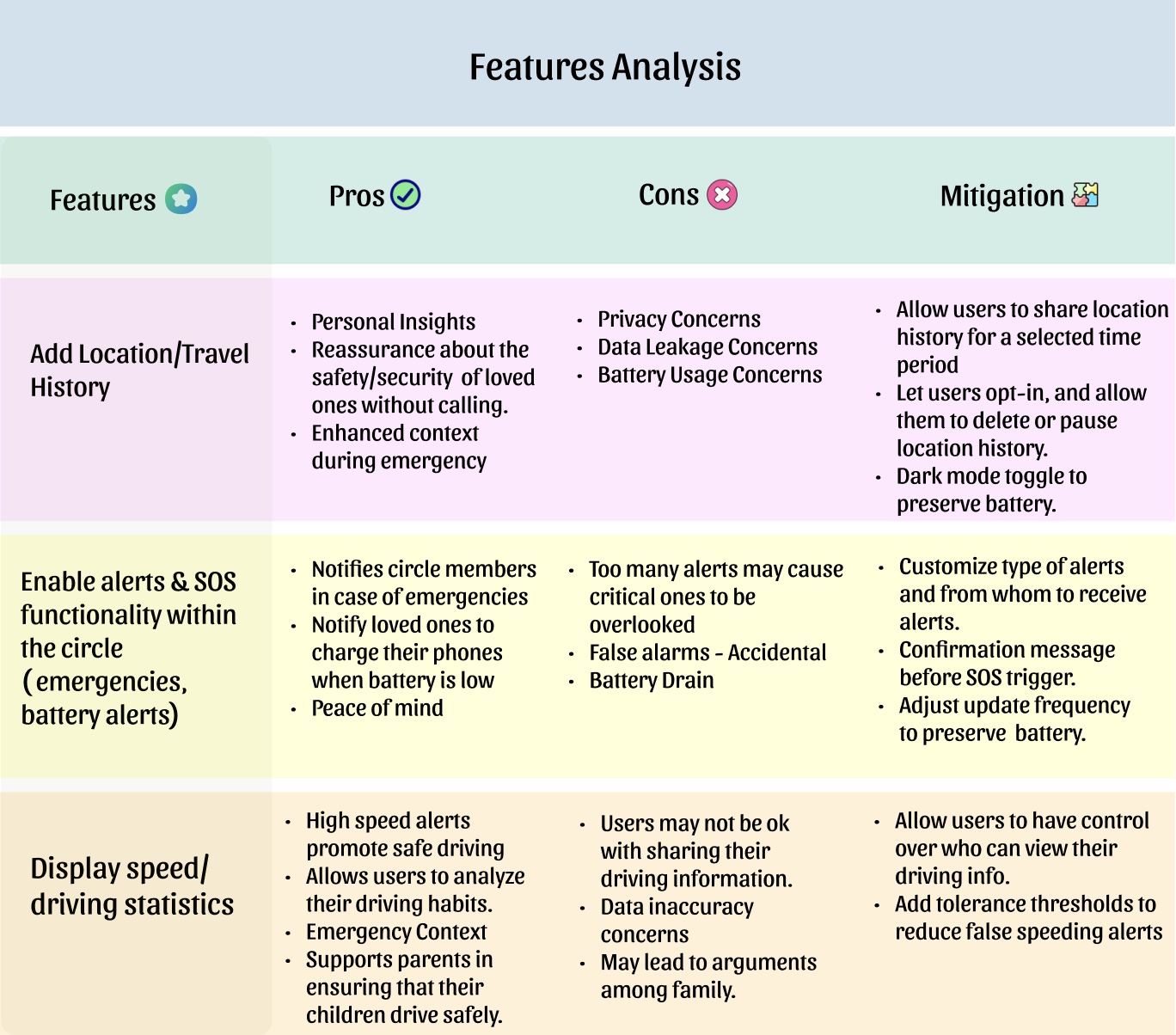
-
Evaluated each proposed feature before adding it to the redesign.
-
Analyzed benefits and risks for each feature.
-
Identified privacy, battery usage, and alert fatigue as main concerns.
-
Designed mitigation strategies to reduce friction.
-
Ensured new features balance safety with user control.
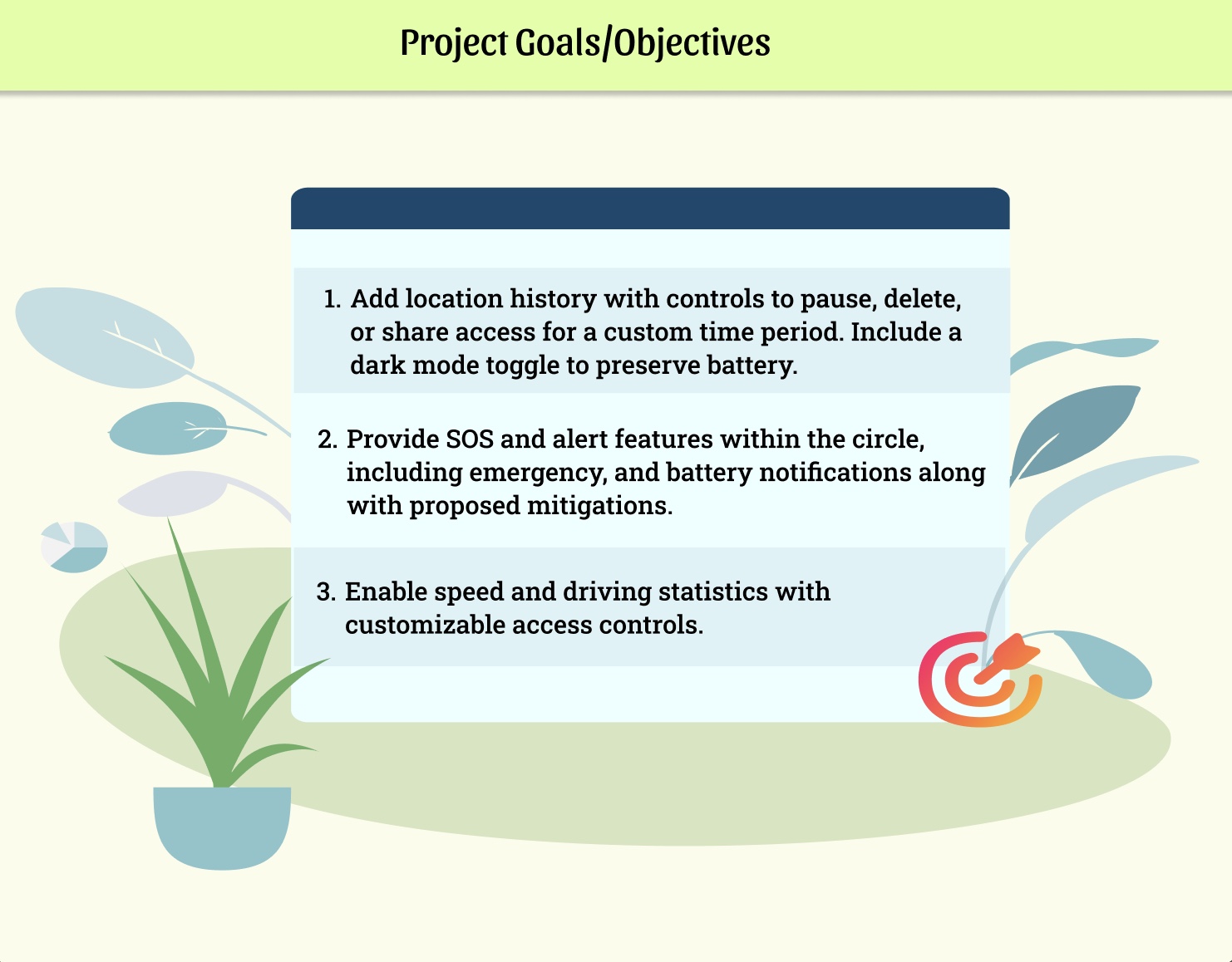
Final Project Goals
-
Set clear goals based on insights from competitor analysis and user interviews.
-
Focused on improving safety while giving users more control and transparency.
-
Added meaningful safety features without making the app feel complex or overwhelming.
-
Aimed to enhance safety while maintaining Apple’s clean, built-in experience.
User Flow
After defining the project goals, I translated the new features into a structured user flow. This helped me understand how users would navigate through the updated experience and ensured the added safety features felt seamless and easy to access.
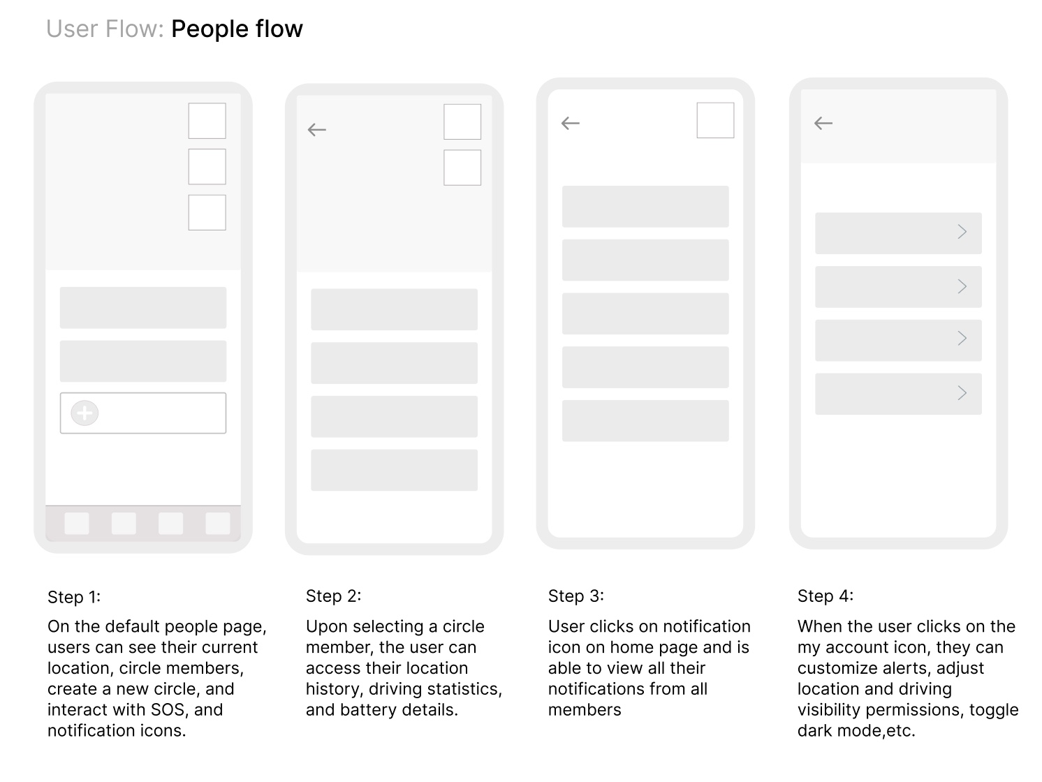
-
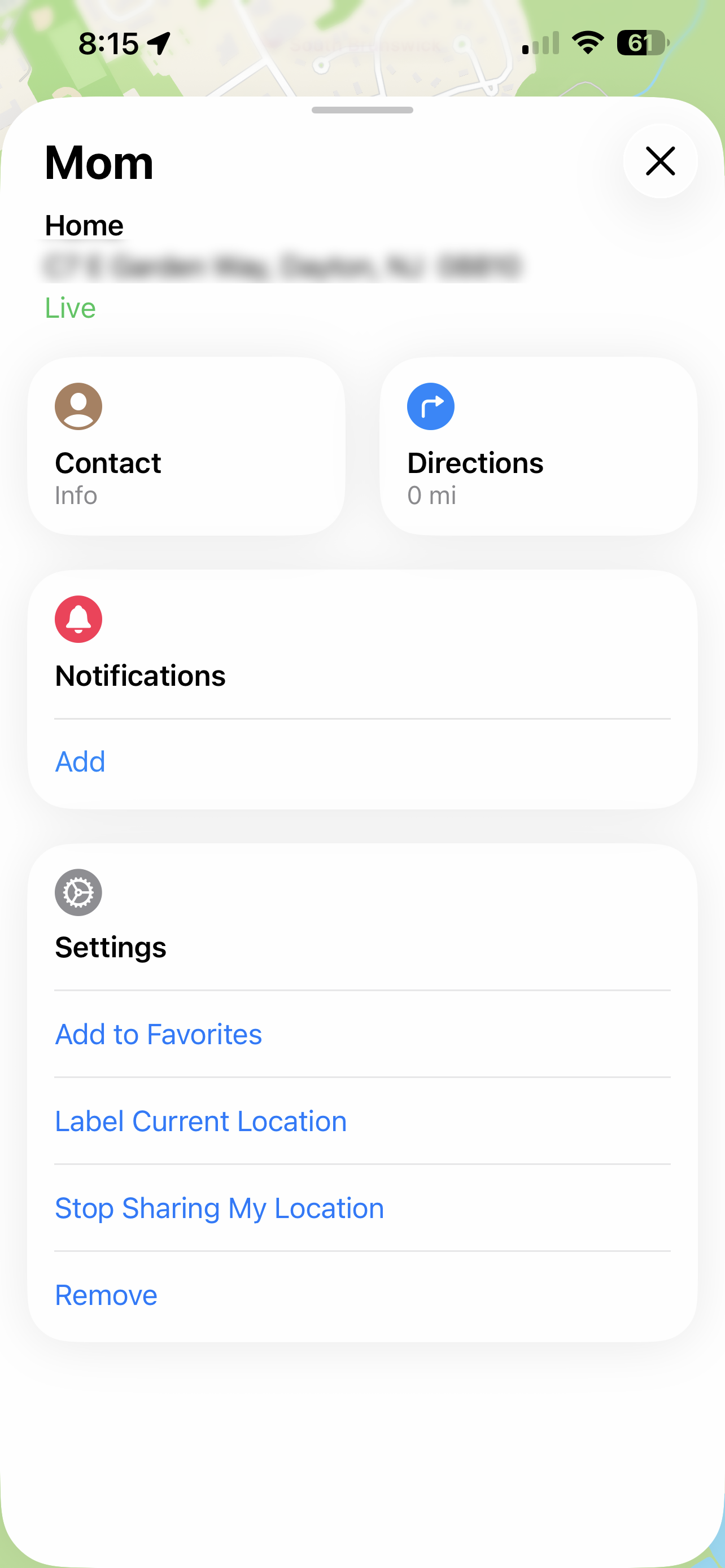
Redesigned the main People screen to show location, circle members, and quick access to SOS and notifications.
-
Made it easy to tap on a member to view their location history, driving stats, and battery level.
-
Added a separate notification screen where users can see all alerts in one place.
-
Included account settings where users can control alerts, sharing permissions, and dark mode.
Wireframes
After finalizing the user flow, I created low-fidelity wireframes to map out layout, structure, and feature placement before focusing on color and visual design. This allowed me to test how the new safety features would fit into the existing experience.
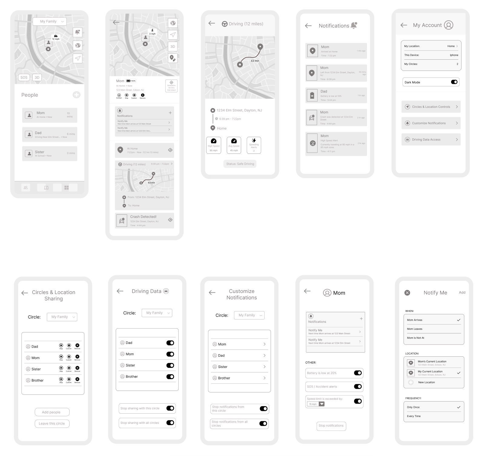
UI Design
Key Screens Designed & Prototyped:
-
People View Screen (circle, location, SOS, notifications)
-
Member Screens (location history, driving stats, notifications, battery)
-
Notification Screen
-
My Account Screen (settings)
I used Apple’s publicly available design system to align with their visual style. I created clean layouts and a minimal user interface. I maintained consistency with the existing Find My design patterns.
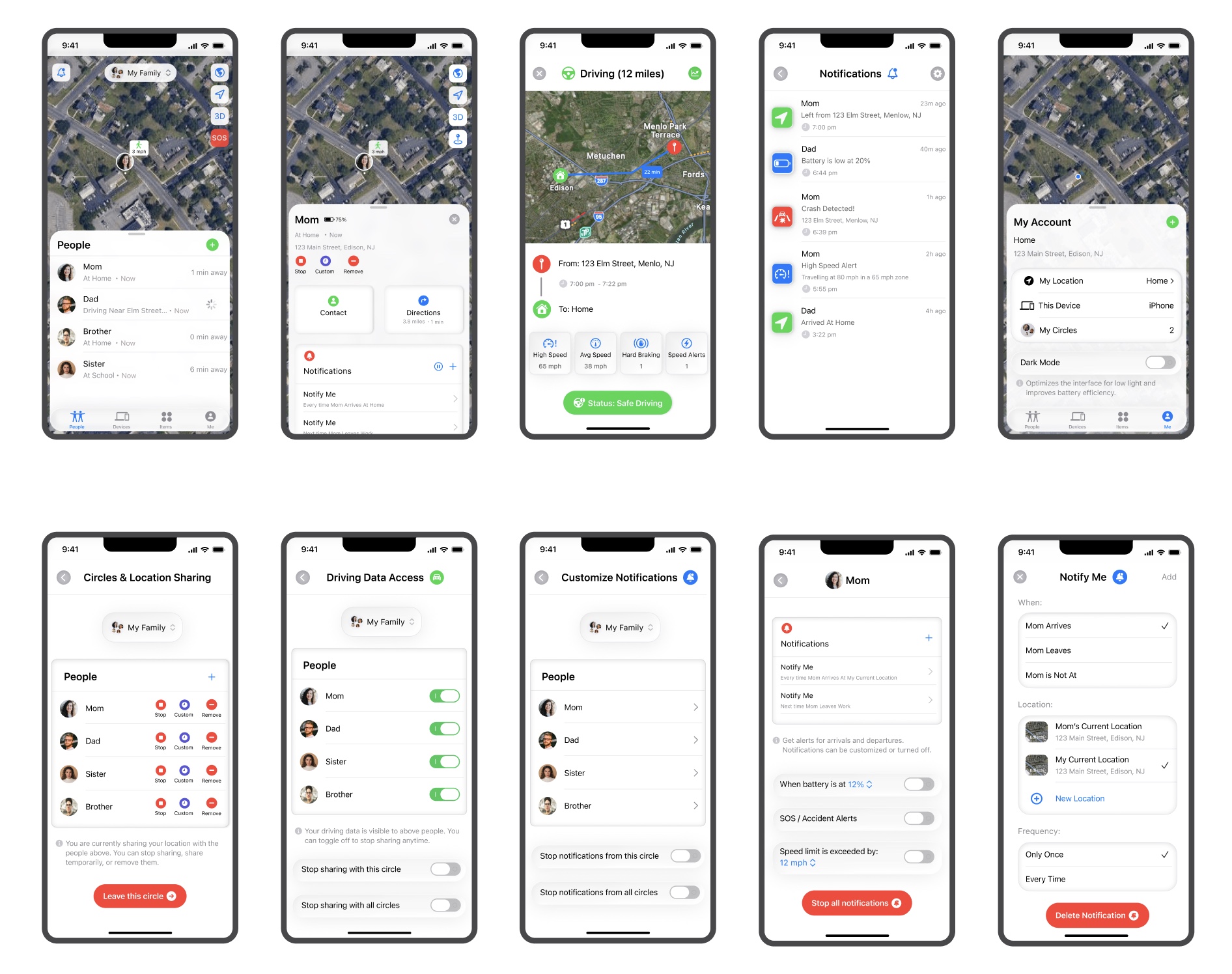
-
Circles & Location Controls Screen
-
Driving Data Access Screen
-
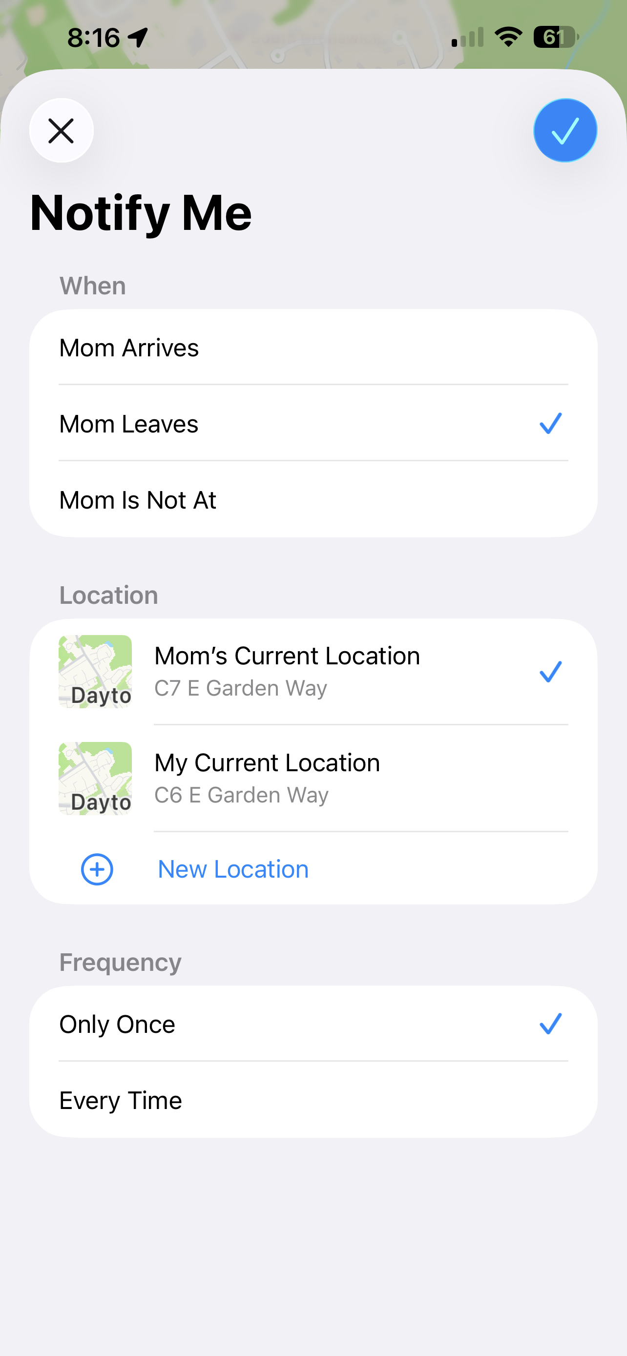
Customize Notifications Screens
-
Overlays for alerts
Key Prototypes
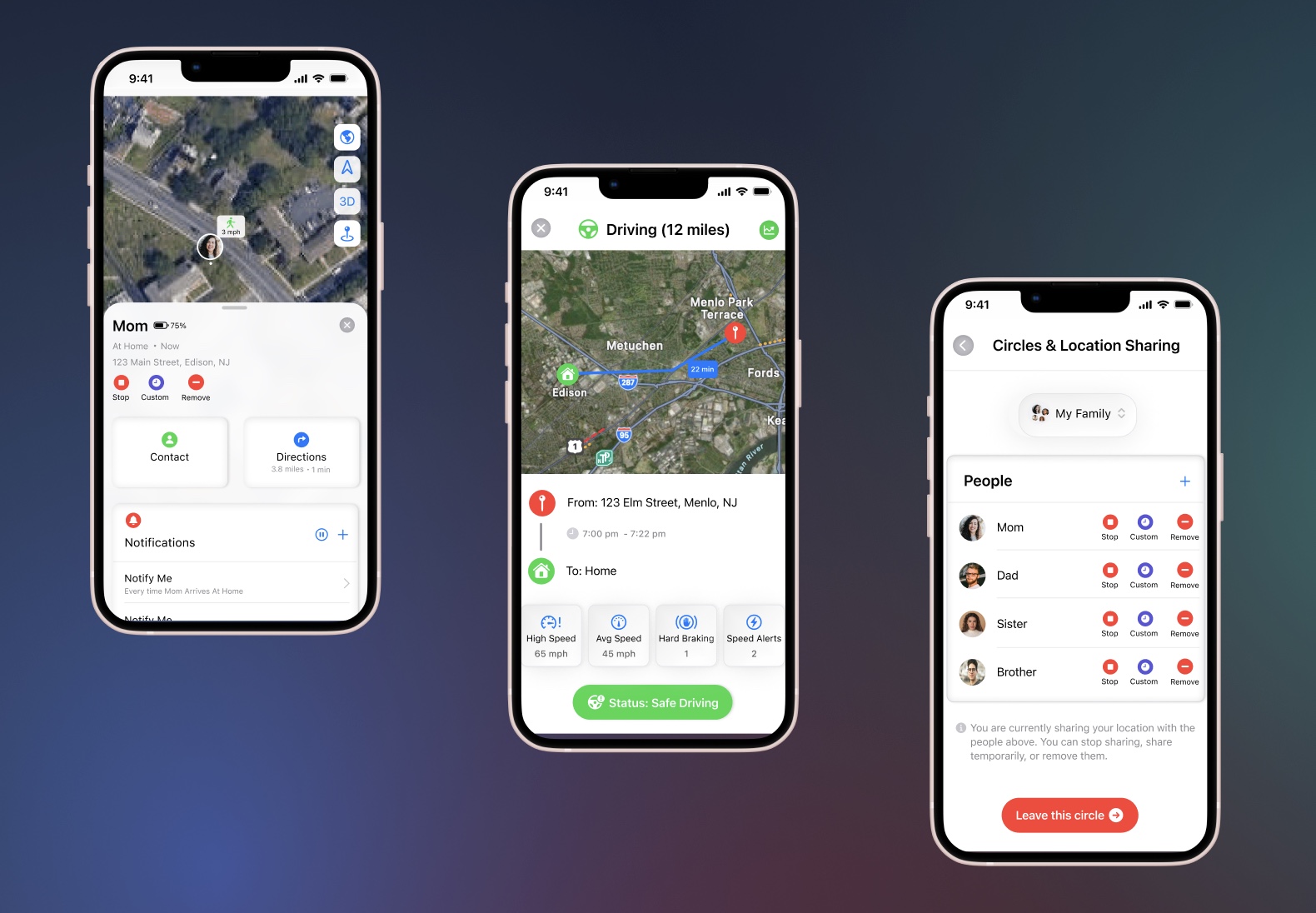
The prototype above highlights the member (Mom) flow screens and demonstrates the various features available, including location history, notifications, driving statistics, and more.
The prototype above showcases the new settings features added to the app, allowing users to control their location access, manage driving history permissions, and add or modify different types of notifications.
User Testing
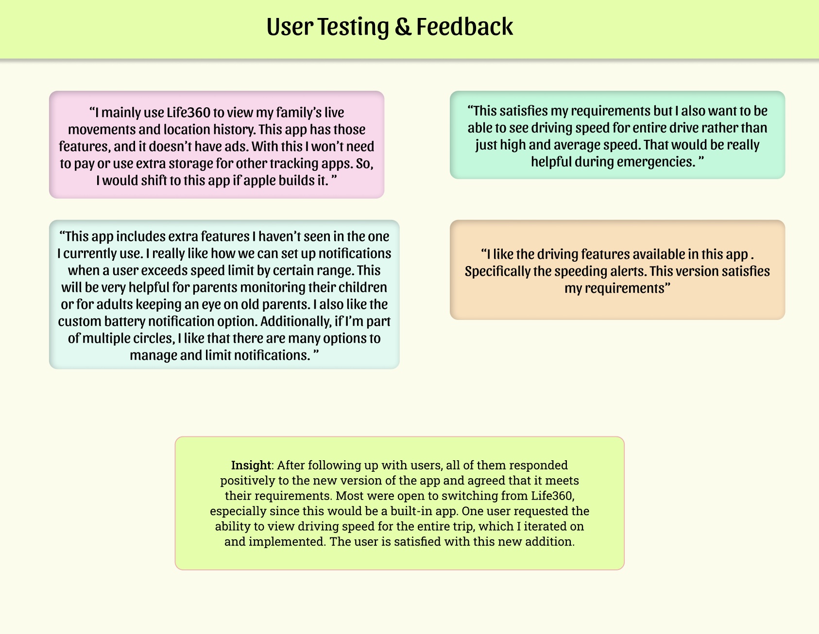
-
Users responded positively to the app.
-
Key features highlighted were live location tracking, speed alerts, and customizable notifications.
-
Most users were open to switching from Life360, confirming that the app meets their needs.
-
One user suggested the ability to view driving speed for the entire trip, which was implemented in a later iteration.
Iteration
Requirement:
“This satisfies my requirements but I also want to be able to see driving speed for entire drive rather than just high and average speed. That would be really helpful during emergencies. ”
Based on feedback requesting full-trip speed visibility, I added a driving speed graph. Tapping the graph icon on the top right overlays a line chart showing speed at key points throughout the journey, providing detailed monitoring that the user requested.
Final Prototype & Reflection
" Overall, I really enjoyed working on this project. Through this project, I learned how to design within the constraints of a company’s design system. I also had the opportunity to conduct different methods of user research and experiment with new animations. The skills I developed during this project will be valuable in my future work. "