Overview
Evergreen is a mobile shopping app designed to deliver a smooth and intuitive e-commerce experience similar to real-life shopping platforms like Amazon. The goal was to design a clean, intuitive interface that supports both browsing and purchasing, while providing a seamless checkout and onboarding experience for both logged-in and guest users.
Many existing apps, including Amazon, prioritize scale and feature depth, which can lead to cognitive overload for users.
I chose to work on Evergreen to explore how a shopping experience could be designed to balance functionality with clarity—focusing on reducing friction, improving trust, and making the overall journey more intuitive.
My Role & Responsibilities
I was responsible for the end-to-end UI design of the app, including:
-
Conducting user research to gather insights from target users
-
Creating the sitemap and user flows
-
Designing wireframes
-
Building low/high-fidelity UI screens
-
Defining color palette and typography
-
Creating reusable components and variants
-
Designing interactive prototypes and visual effects
-
Performing user testing and iterating based on feedback

User Research
Research Goal
To understand:
-
What features users value most in shopping apps
-
What makes users trust or abandon an online store
-
How users discover products and make purchase decisions
-
Pain points in search, checkout, and payment processes
Research Method
I conducted:
-
Interviews with online shoppers
-
Competitor analysis of popular shopping apps to identify best practices and gaps
Competitor Analysis
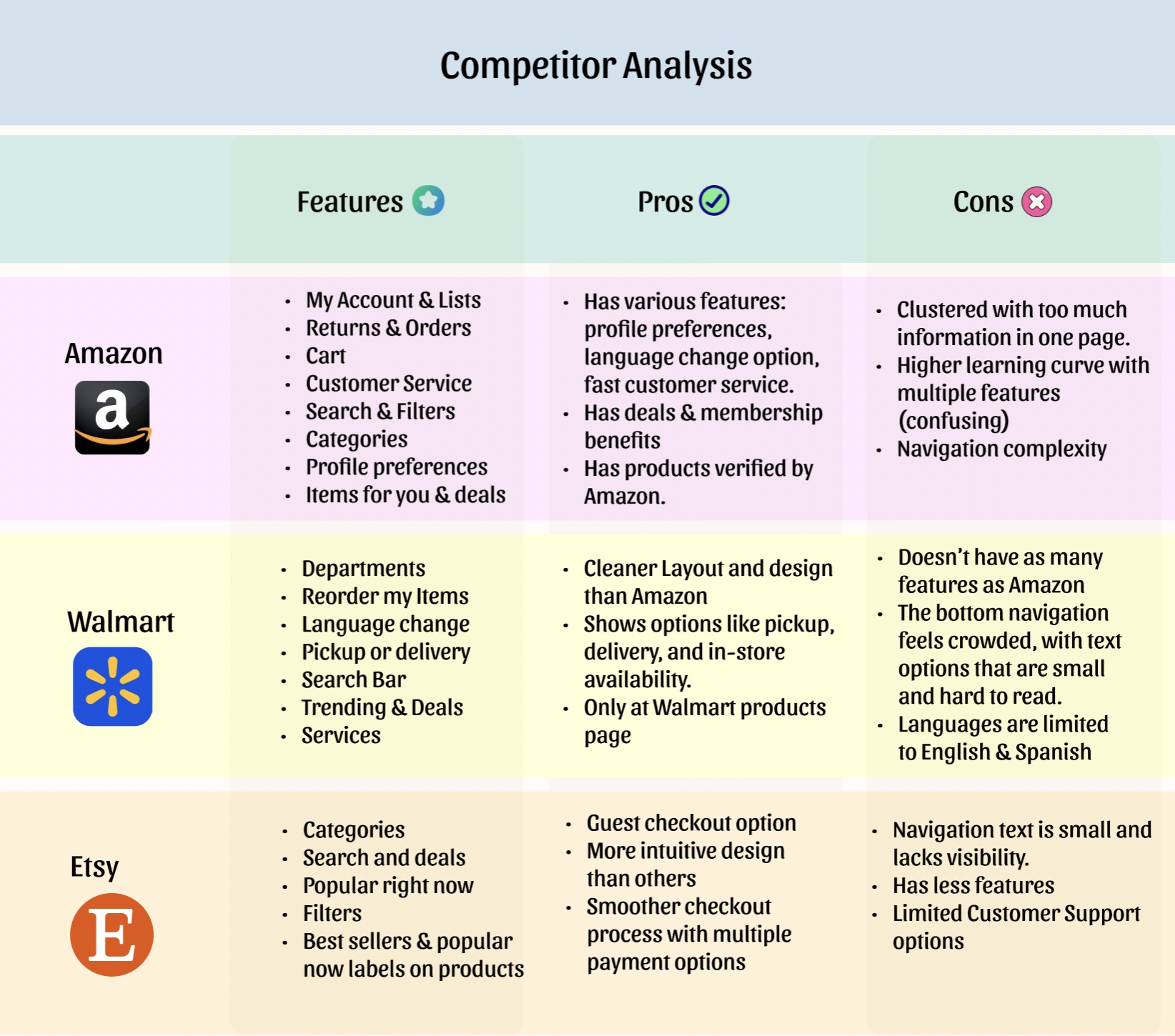
-
Compared major shopping apps to see how their features and user experiences differ.
-
Noticed that Amazon has the most features, but it feels overwhelming and hard to navigate.
-
Saw that Walmart is simpler and easier to use, especially with clear pickup and delivery options.
-
Found that Etsy is more intuitive and has a smoother checkout, but offers fewer features overall.
-
Identified an opportunity to create a balance between useful features and a clean, easy-to-use design.
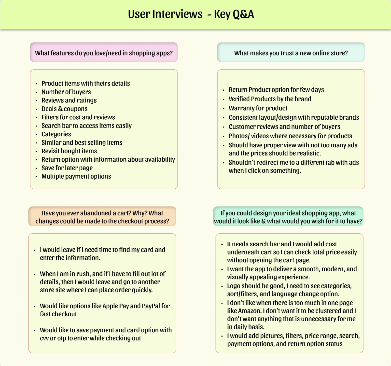
User Interviews
-
Interviewed online shoppers to understand their needs, preferences, and pain points with shopping apps.
-
Features like product details, reviews, deals/coupons, filters, and multiple payment options were repeatedly mentioned by users
-
Many users abandon carts if checkout is slow or requires too much information, and prefer fast payment methods like Apple Pay/PayPal.
-
Users want a clean, uncluttered interface with minimal ads and clear return policies.
-
Clear navigation, search bar, categories, similar items, and saved/revisit options are essential to users.
Final Project Goals
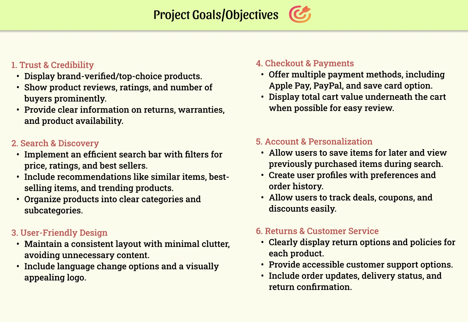
-
Set clear project goals based on insights from user interviews and competitor analysis.
-
Focused on building trust, creating personalized experiences, and streamlining the checkout process with multiple payment methods.
-
Included features such as search, filters, categories, and labels (e.g., best-seller, Top pick) to help users discover the top products easily.
-
Aimed to make the shopping experience smooth, clear, and satisfying for users.
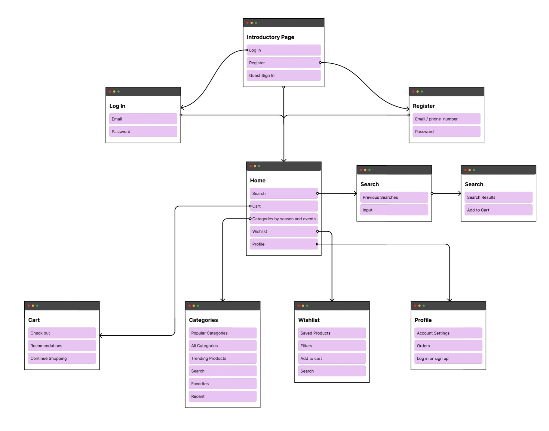
Sitemap
After defining clear objectives for the project, I created a sitemap to brainstorm and get a high-level overview of the required screens and the pages that should be nested under each.
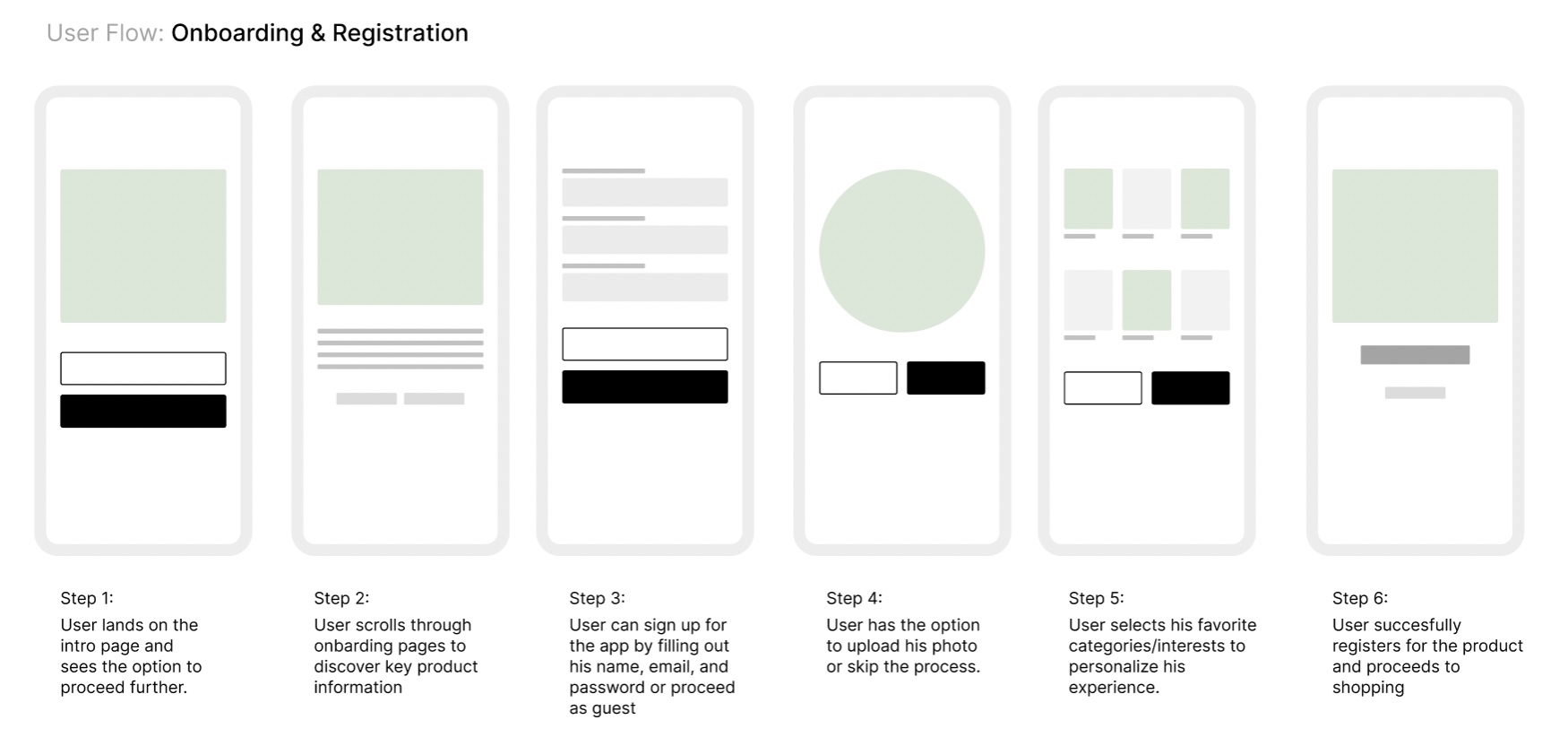
User Flows (UI)
Next, I designed user flows to visualize how users would navigate through onboarding, registration, and the checkout process.
Wireframes
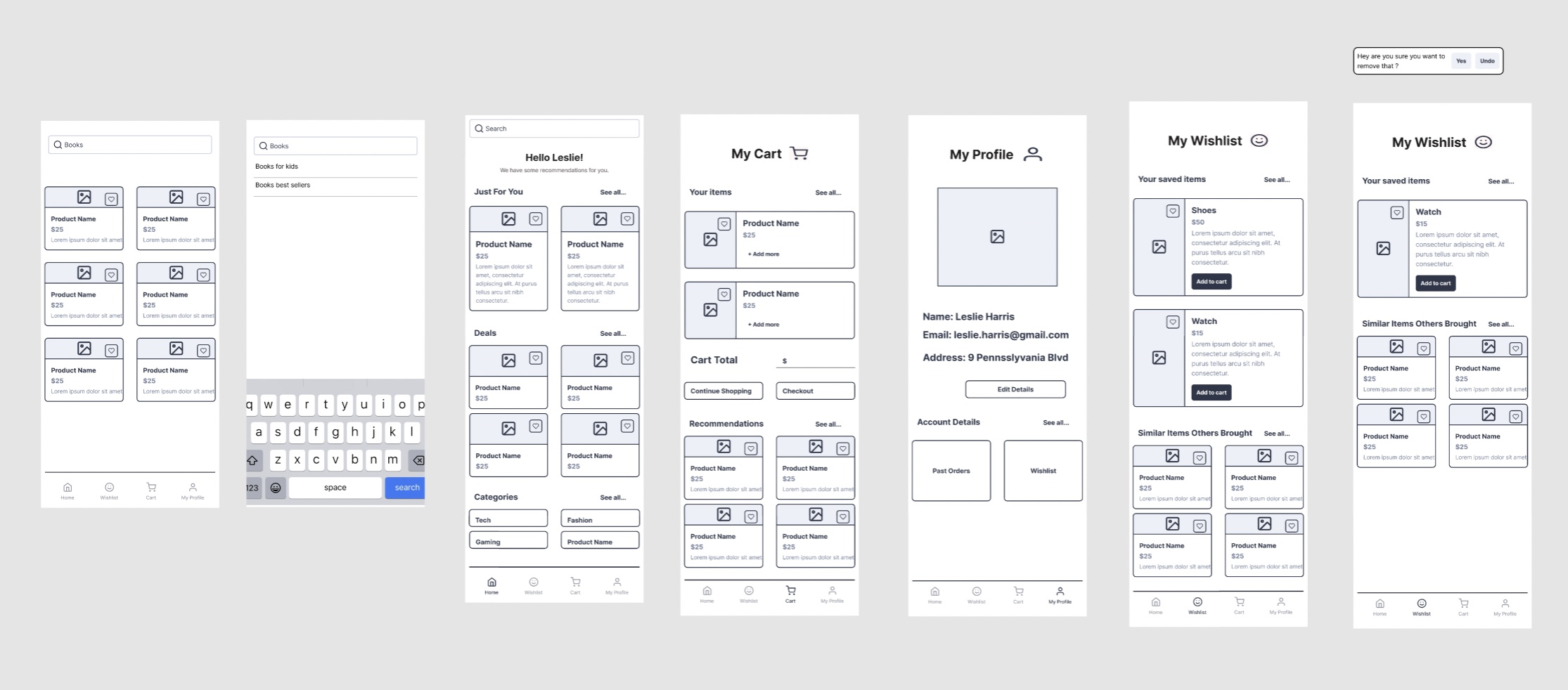
After user flows, I created some low-fidelity wireframes to plan the layout, navigation, and organize content before moving to the UI design. This process helped me visualize the structure of key pages and ensure a logical content hierarchy.
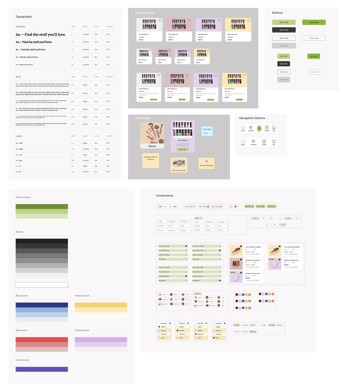
Design System
To maintain consistency and scalability, I created a design system.
Included:
-
Color palette
-
Typography styles
-
Button Styles
-
Product Cards, Text Cards, Navigations
-
Components
UI Design
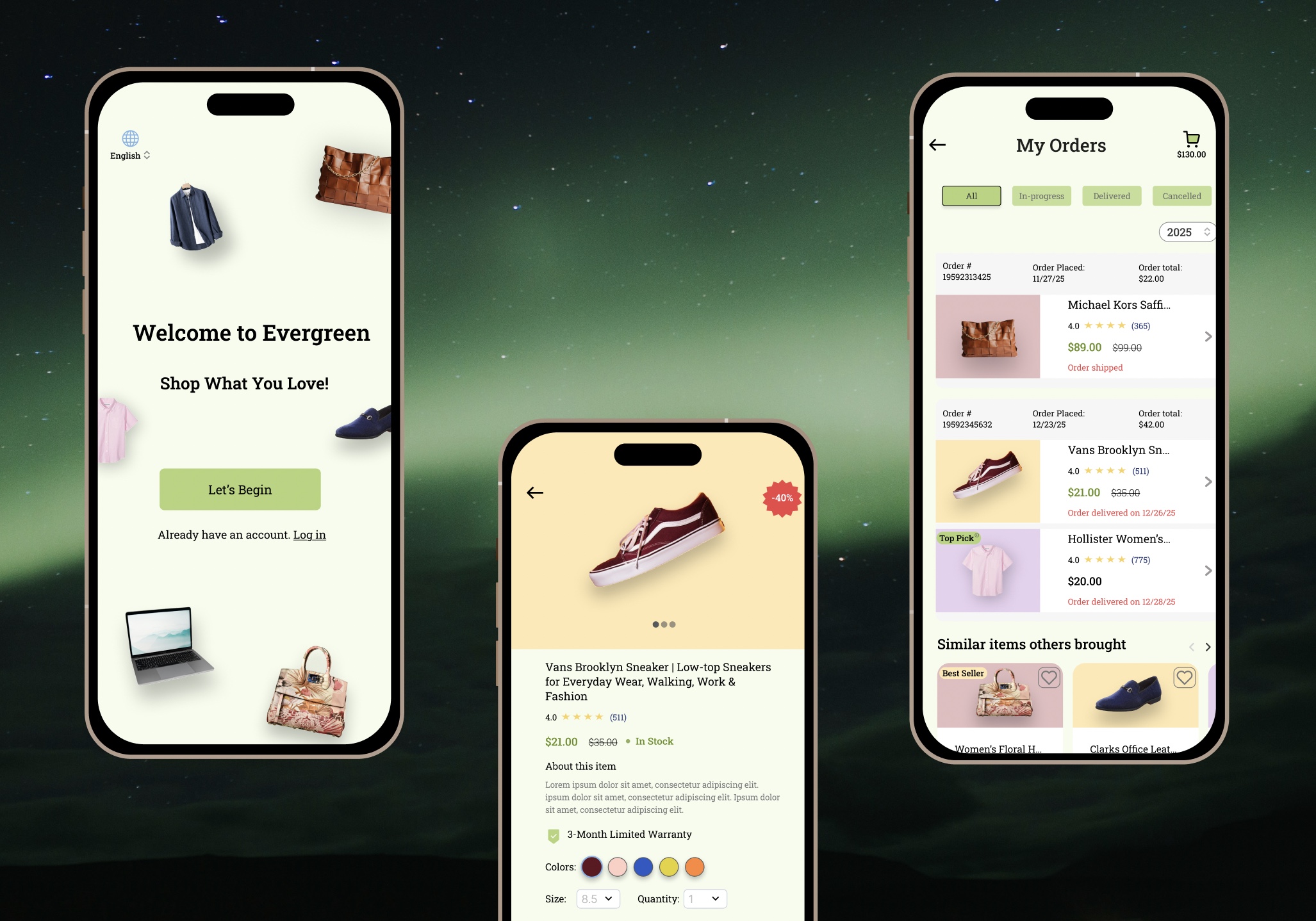
Key Screens Designed & Prototyped:
-
Onboarding screens
-
Registration & login screens
-
Home page
-
Profile page
-
Wishlist page
-
Categories page
-
Cart page
-
Checkout flow
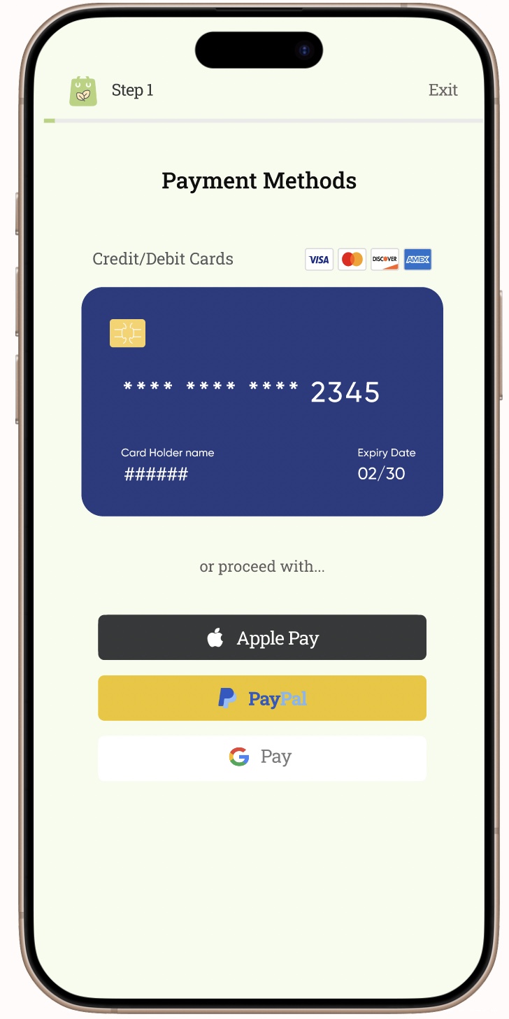
I designed interfaces for both logged-in and guest users, allowing guests to proceed to checkout without creating an account. Based on insights from user interviews, I also integrated faster payment options like Apple Pay and PayPal, with their own checkout flow to reduce abandonment rates.
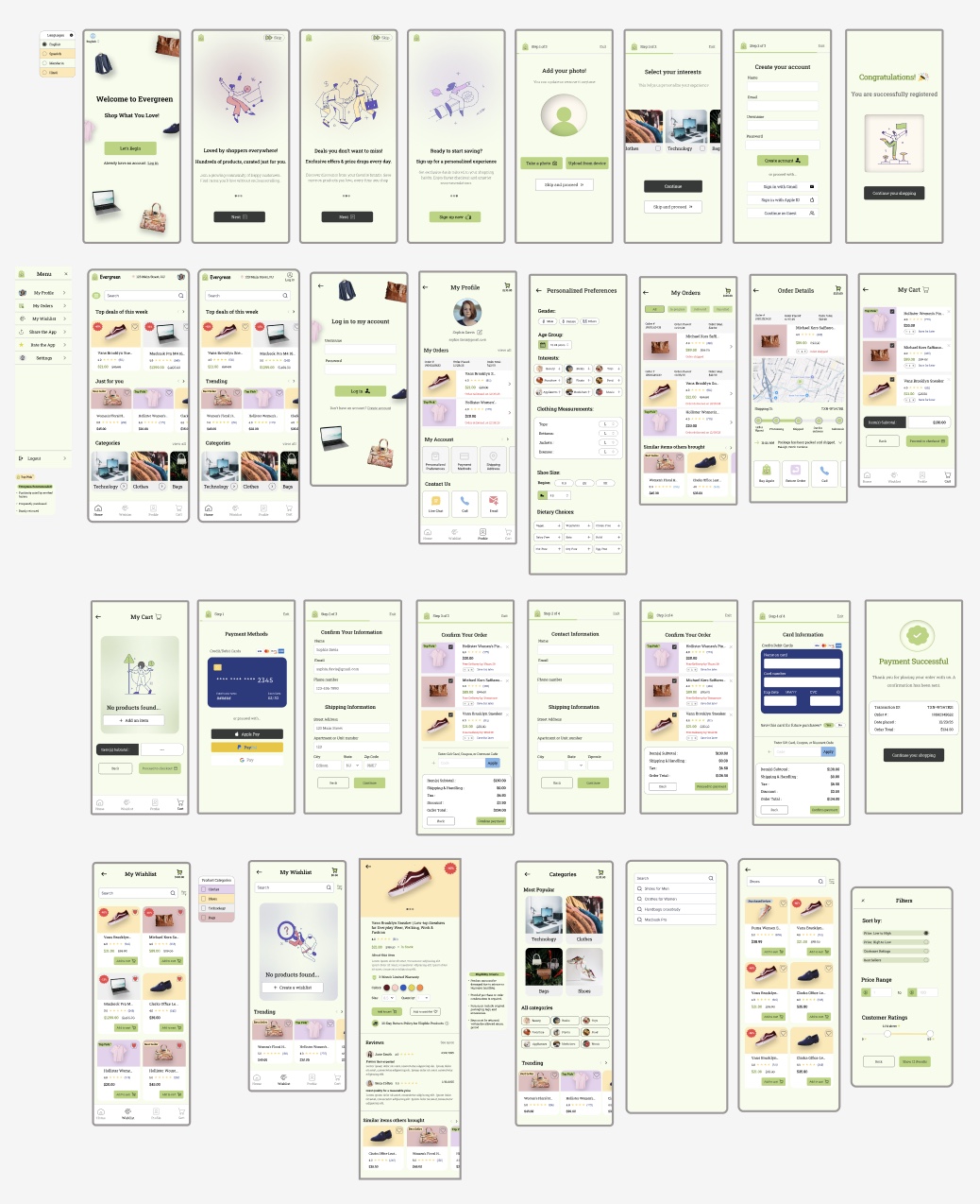
Key Prototypes
The prototype above walks through the onboarding and registration flow that users go through when first entering the app, before moving on to the shopping experience. It offers several ways to continue, including creating an account, signing in with Gmail, or proceeding as a guest.
The prototype above demonstrates the checkout flow, offering multiple payment options, including credit/debit cards, as well as automated methods like Apple Pay and Google Pay. These automated options pull users' information directly from their payment accounts and allow them to review or edit their details before confirming their payment.
The prototype above highlights the profile page, guiding users through pages such as order history, order details, and the personalized preferences page, which tailors search results based on selections made there.
User Testing
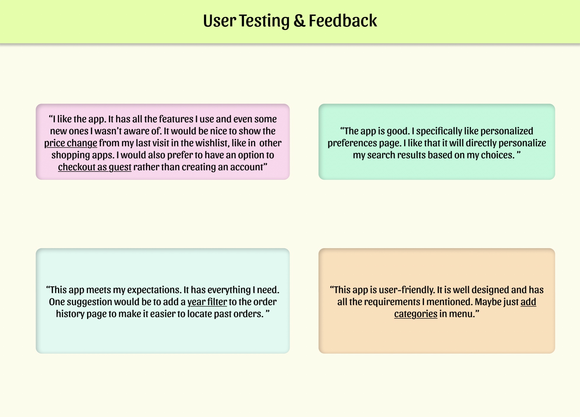
-
Users found the app intuitive, well-designed, and aligned with their expectations.
-
They felt the app successfully included essential features and introduced useful ones they hadn’t anticipated.
-
The personalized preferences page was highlighted as particularly useful for improving search results.
-
Their feedback highlighted opportunities to improve navigation, wishlist tracking, checkout, and order history filtering, which will be addressed in the next iteration.
Iteration
Key changes made based on user feedback:
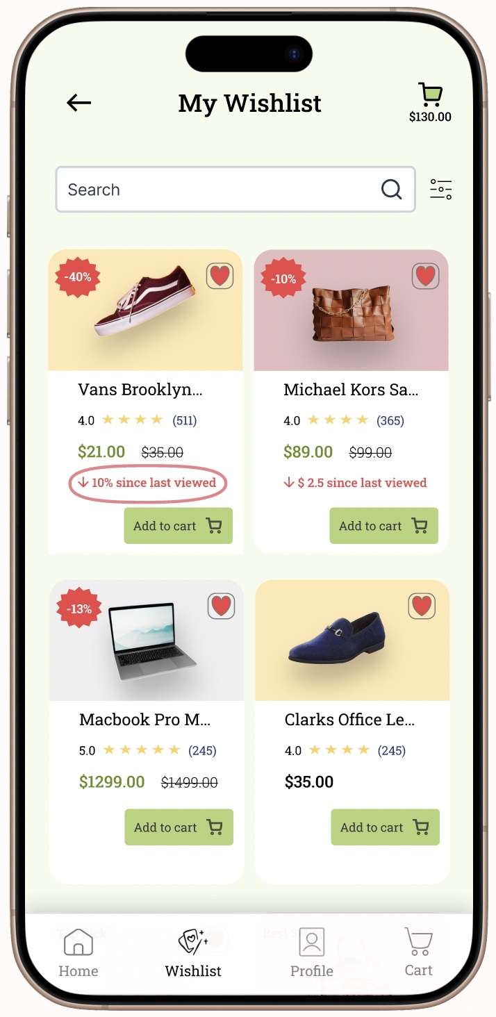
-
Added price change indicators in the wishlist page
-
Introduced a guest checkout option
-
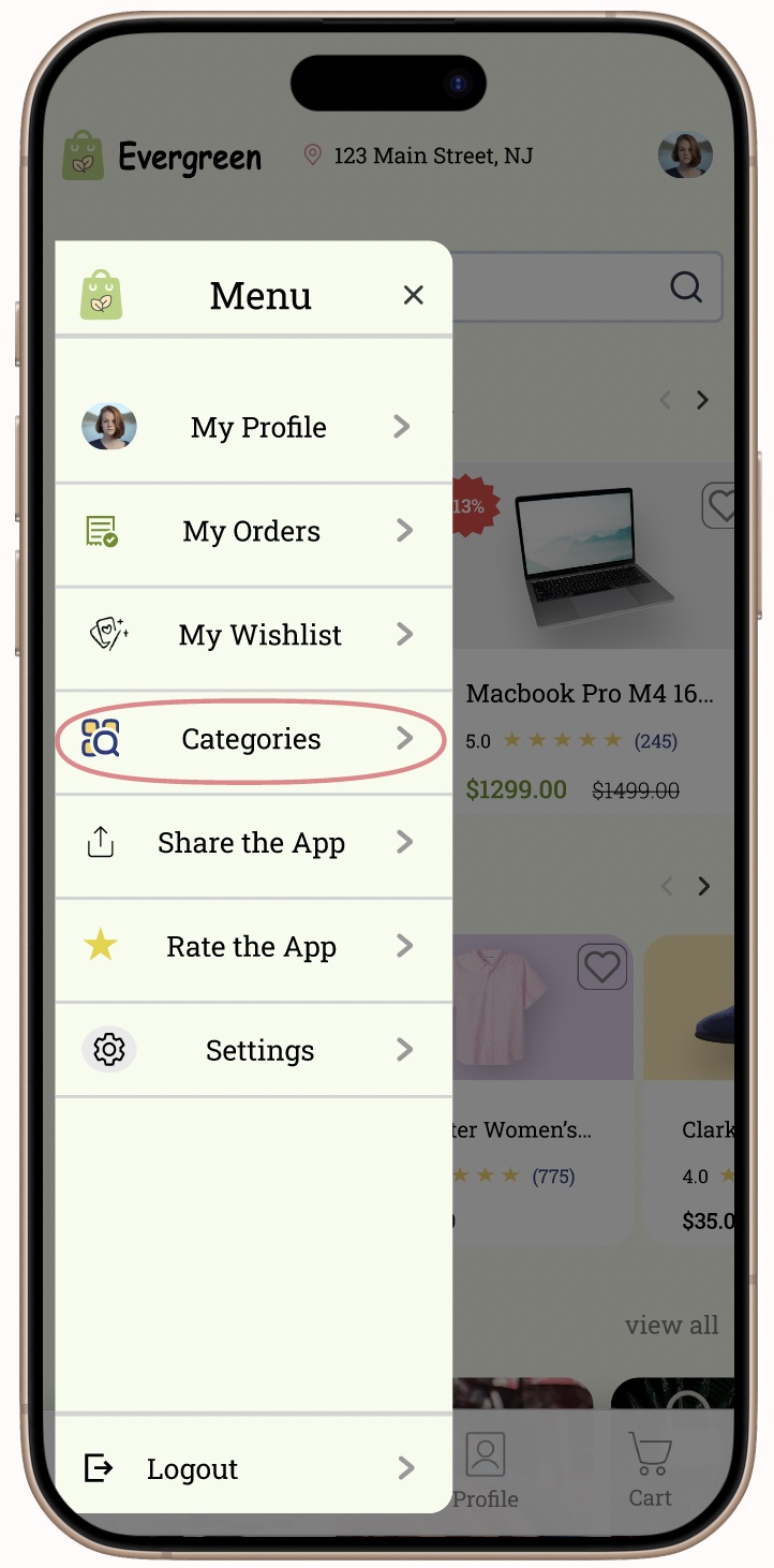
Added categories in the menu for better navigation
Results: The users were satisfied with the changes made and found the app more convenient. These improvements helped enhance the overall user experience and addressed the pain points identified during testing.
-
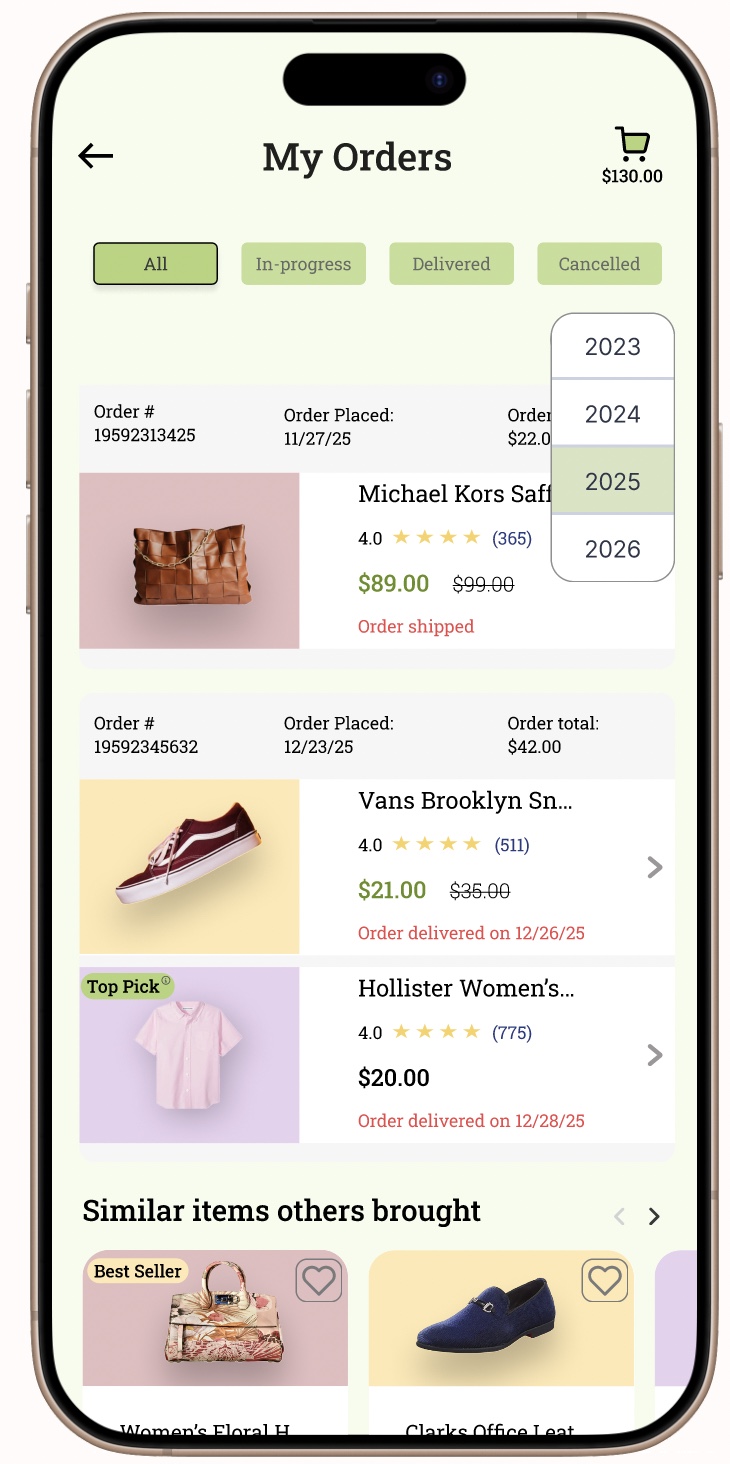
Implemented a year filter in the order history page
Final Prototype & Reflection
"Overall, this was a fun app to work on, providing me with hands-on experience in developing a complete end-to-end application. It also allowed me to gain and apply business knowledge about the e-commerce industry. Through frequent user interaction and competitor analysis, I was able to make the app more user-friendly, incorporating the features most commonly used by target users."