Overview
Lors Photography partners with Rutgers University to provide senior portrait services for graduating students. To schedule a session, students must log in to the Lors Photography website and book an appointment online. As a recent Rutgers graduate, I experienced this booking process firsthand.
Motivated by my own experience and the challenges I encountered, I initiated this project to improve the senior portrait booking experience. In this case study, I analyze the current appointment-booking flow on the Lors Photography website and identify key usability issues. Using insights from my personal experience as well as feedback from fellow Rutgers students, I proposed and implemented UI improvements to create a smoother, more intuitive booking process.

User Research
Research Goal
To understand:
-
Pain points students face when booking senior portraits
-
Confusing or frustrating steps in the current flow
-
Features that would make the scheduling easier and faster
-
How to improve trust and satisfaction in the booking flow
Research Method
I conducted research combining:
-
A first-person journey map based on my own booking experience
-
Peer interviews from fellow Rutgers students
-
An analysis of recurring pain points, translated into clear design opportunities
Journey Mapping
I started by mapping the full booking experience, from logging in to receiving the appointment confirmation.
This exercise helped me:
-
Visualize emotional highs and lows throughout the flow
� -
Identify specific friction points at each stage
-
Capture user thoughts, confusion, and unmet expectations
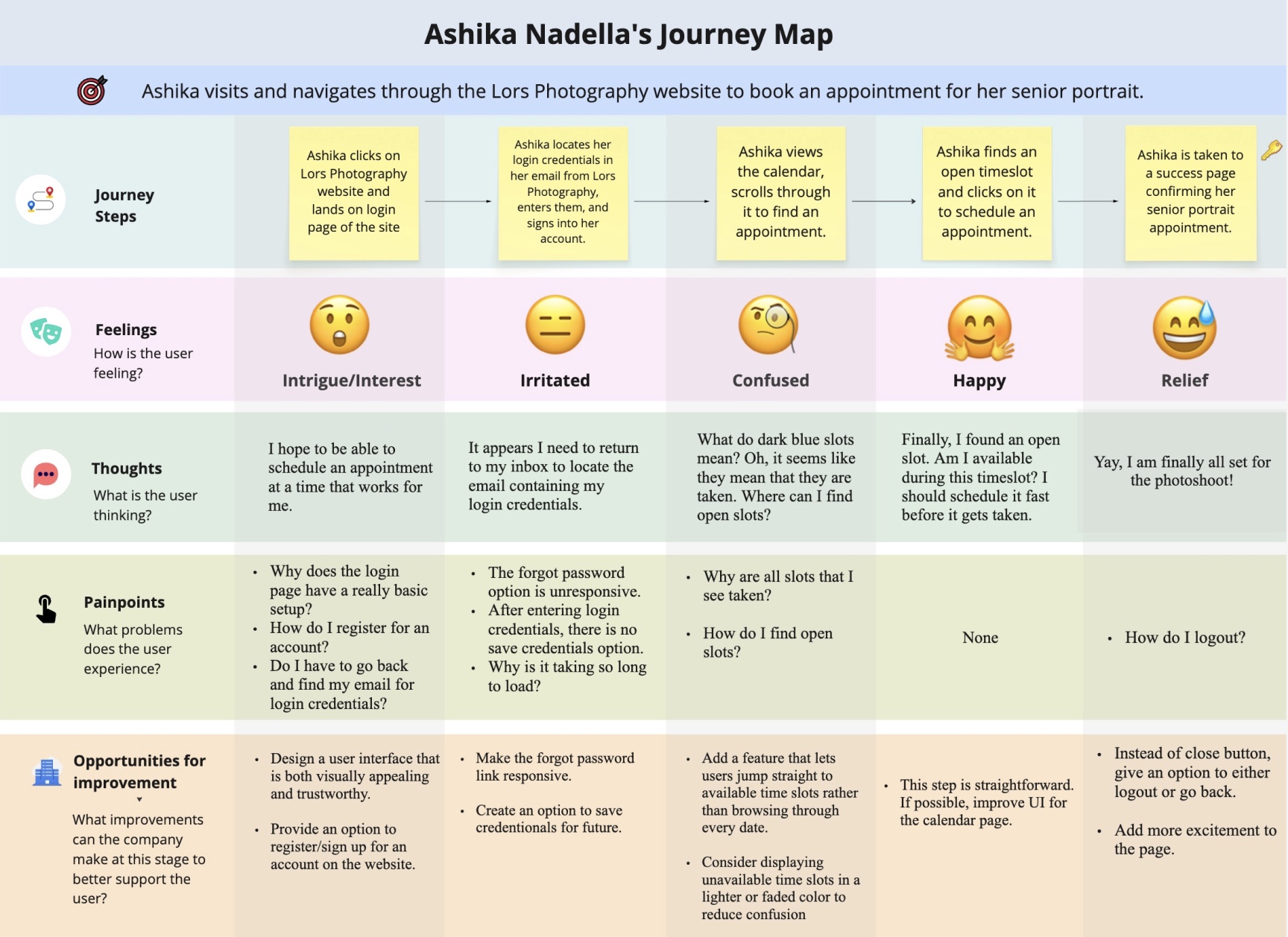
Key Observations
-
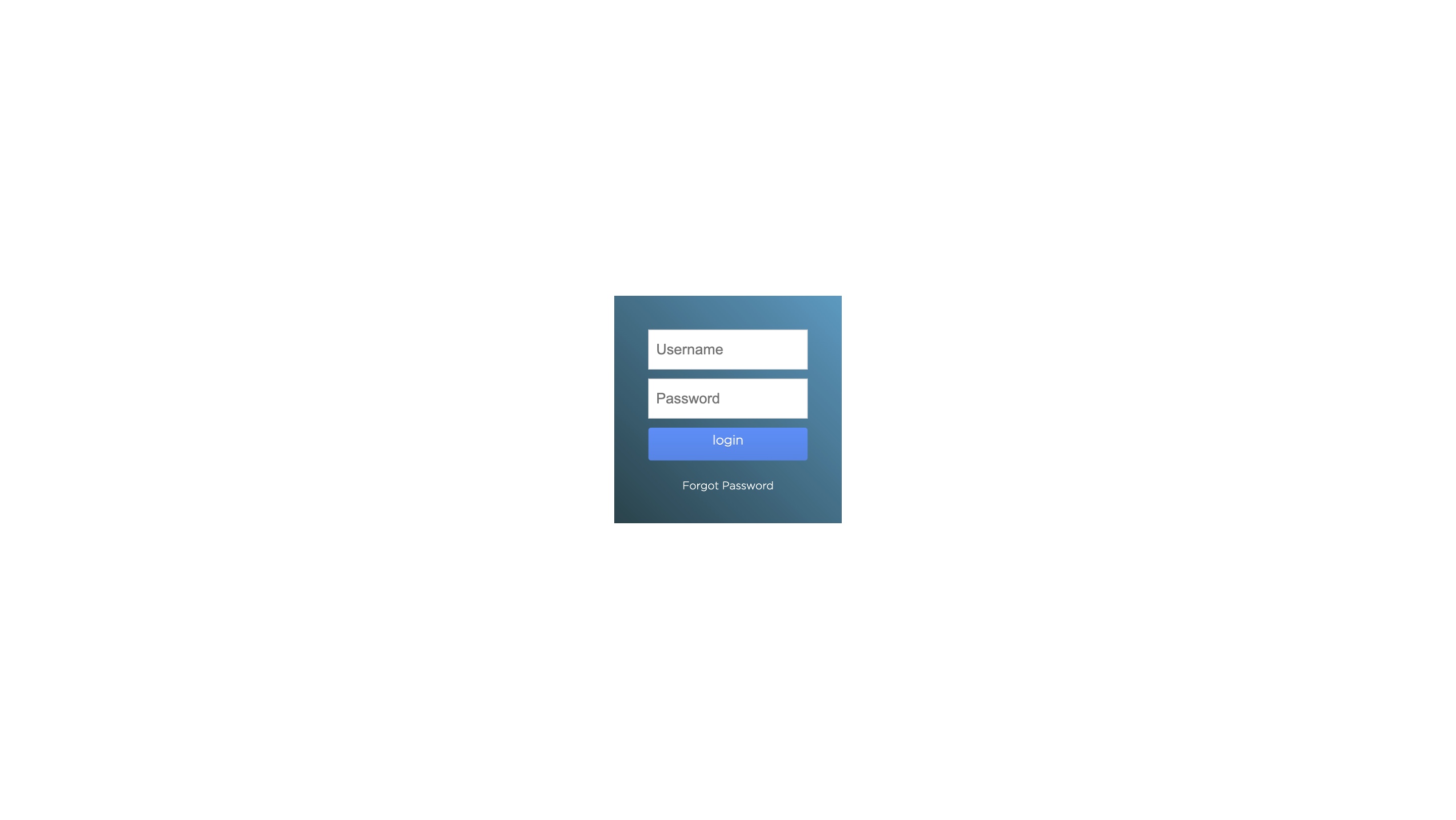
Login friction: Users must retrieve credentials from email, no save-login option, and the outdated UI reduces trust.
-
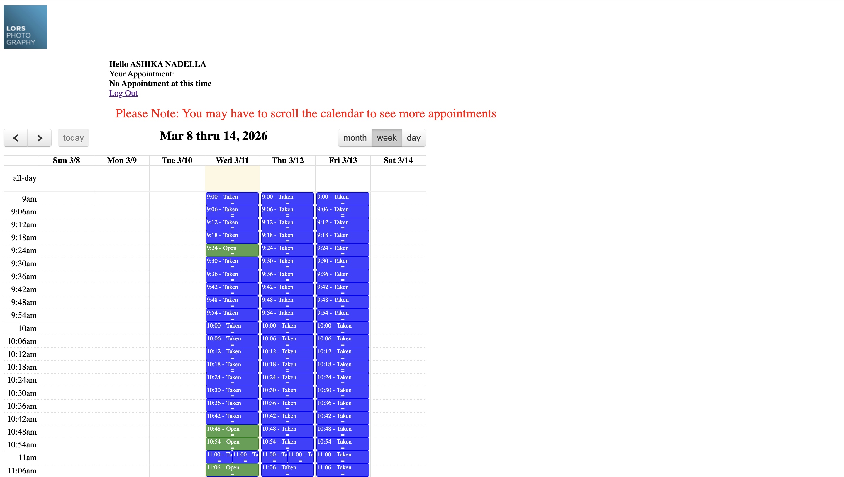
Calendar confusion: Time slot availability is unclear, and finding the next open slot requires scrolling through many dates.
-
Performance issues: Slow load times and occasional crashes during high traffic.
-
Weak completion experience: No clear logout/back option. The confirmation page lacks excitement for a milestone event
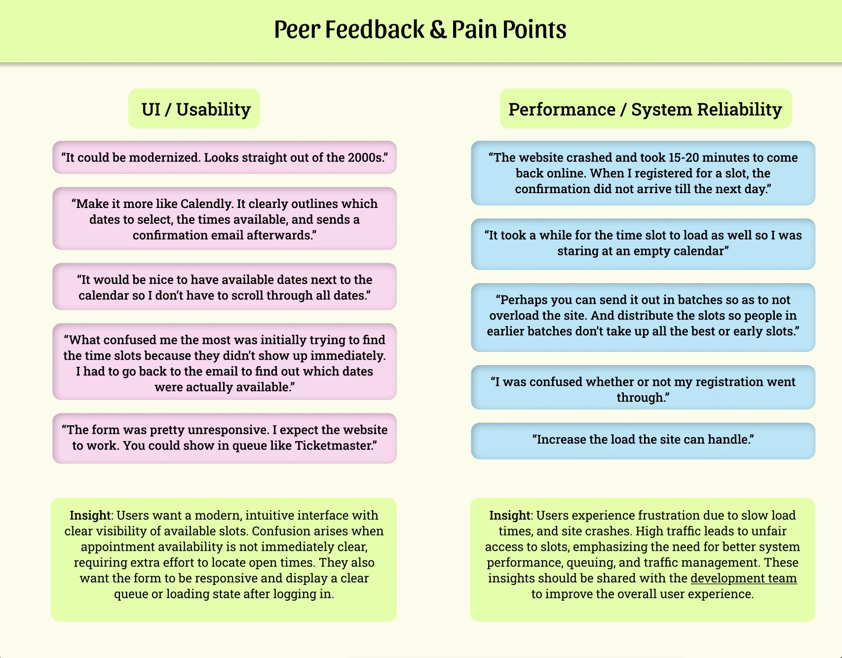
User Interviews
To determine whether my experience was a personal frustration or a broader usability issue, I gathered feedback from Rutgers students who also scheduled their portrait appointments with Lors Photography.
I noticed that many people were confused about which time slots were actually available and felt frustrated when the system was slow or unresponsive during busy times. Because these concerns came up repeatedly, it was clear that the problem wasn’t just about how the site looked — it was affecting how easy it was to use and whether users trusted the process.
This feedback helped me focus on improvements that directly addressed these pain points.
Final Project Goals
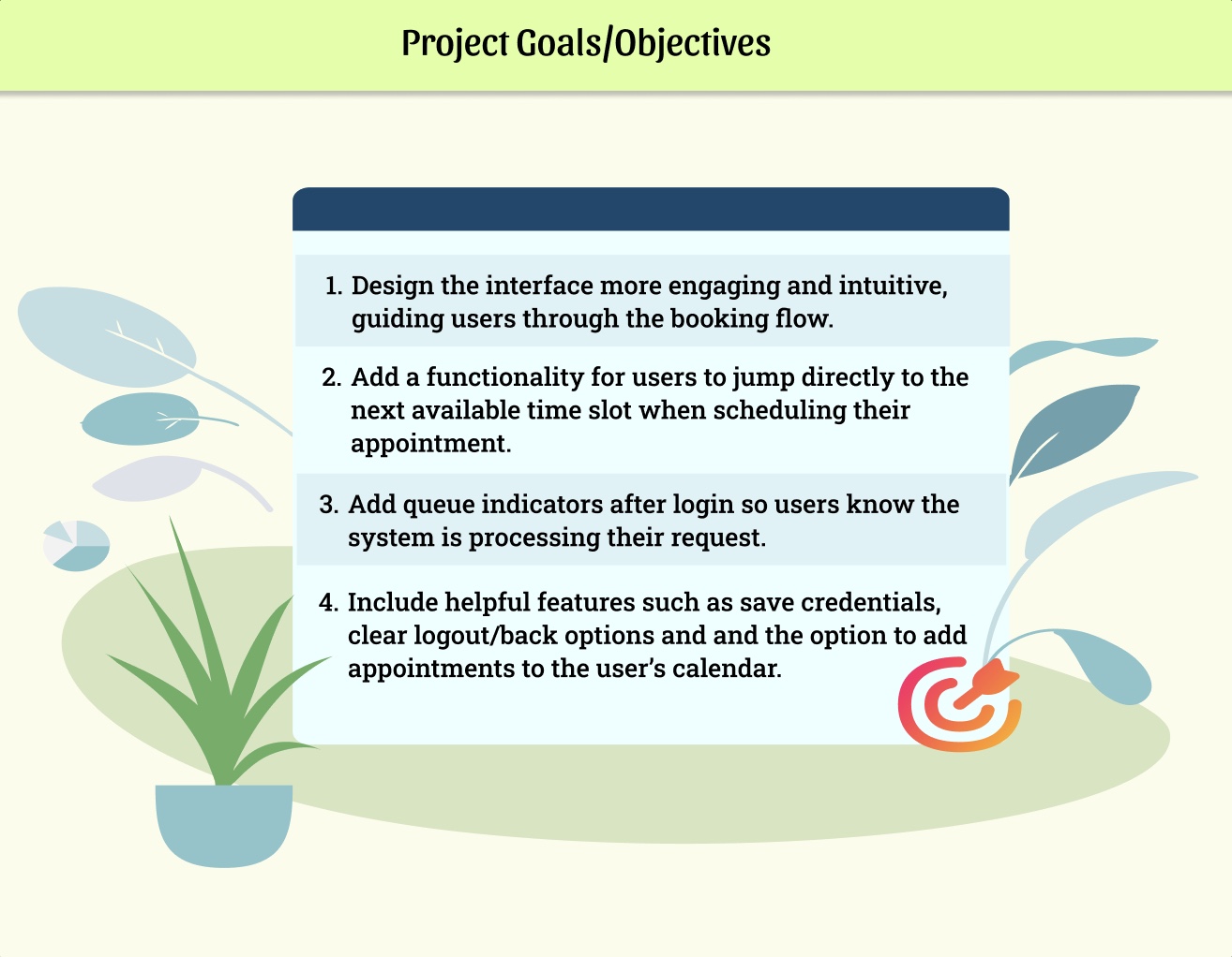
-
Reviewed my journey map and peer feedback to identify the main user needs.
-
Developed four clear design goals
-
Prioritized these goals based on the issues reported that most affected the booking flow.
User Flow
After identifying friction points from user research, I redesigned the user flow to reduce uncertainty and improve the appointment scheduling experience.
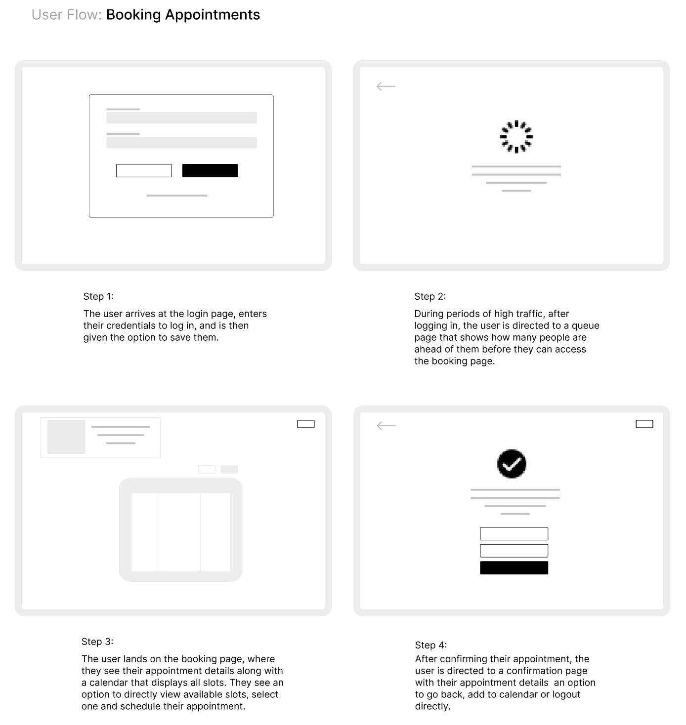
Key structural improvements in the new flow include:
-
Introducing a queue page to manage high-traffic periods transparently
-
Allowing users to jump directly to available time slots
-
Reducing excessive scrolling through unavailable dates
-
Providing clearer confirmation and exit options
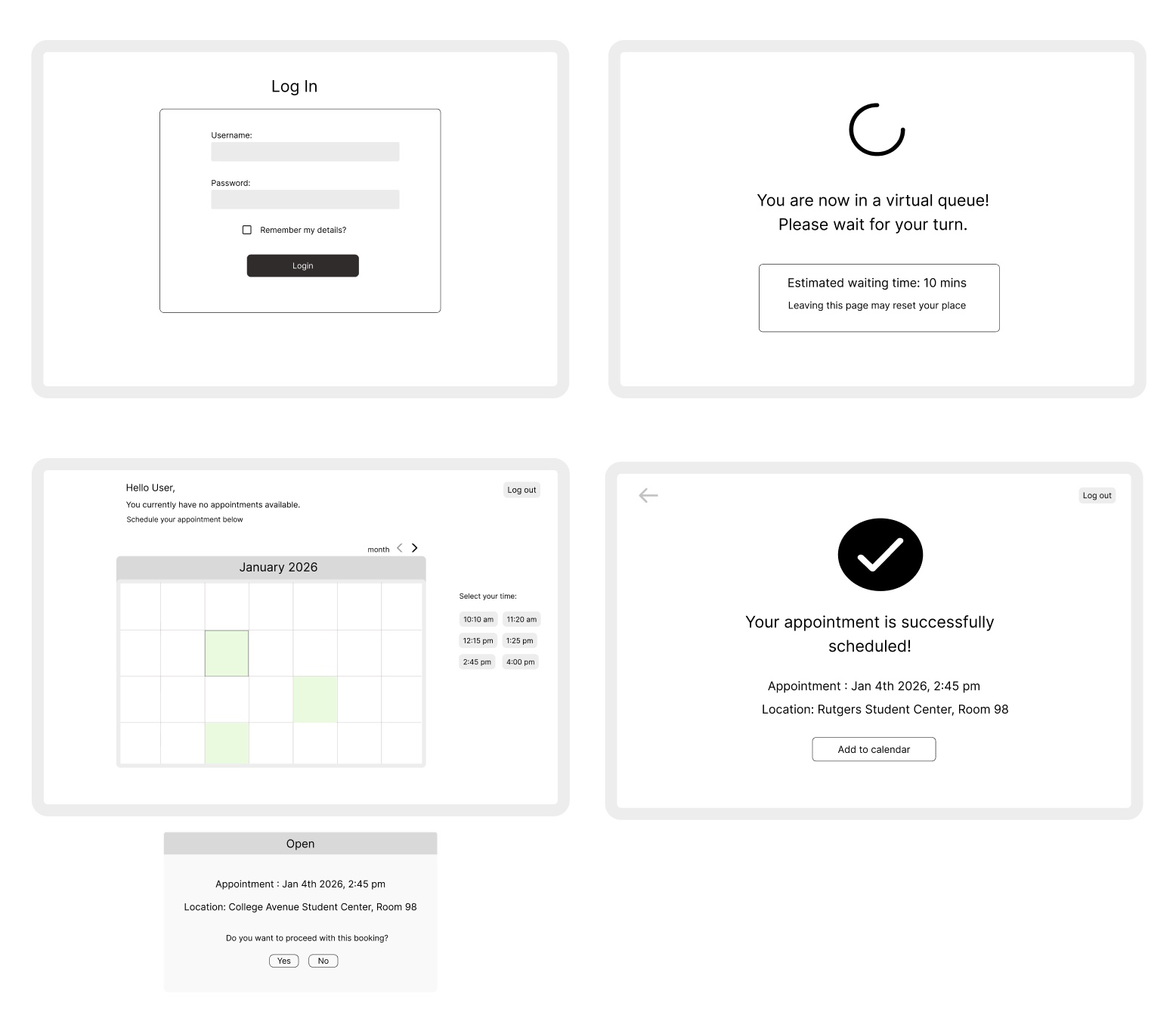
Wireframes
After defining the user flow, I created low-fidelity wireframes to focus on layout, hierarchy, and interactions before moving into visual design.
Design System
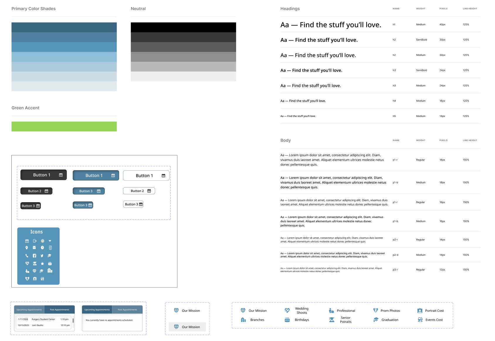
Built a design system to keep things consistent and easy to update.
Included:
-
Color palette
-
Typography styles
-
Button Styles
-
Icons
-
Key Components
UI Design
Key Screens Designed & Prototyped:
-
Log In page
-
Virtual Queue page for high traffic
-
Booking Appointment page with overlay
-
Confirmation page with calendar overlay
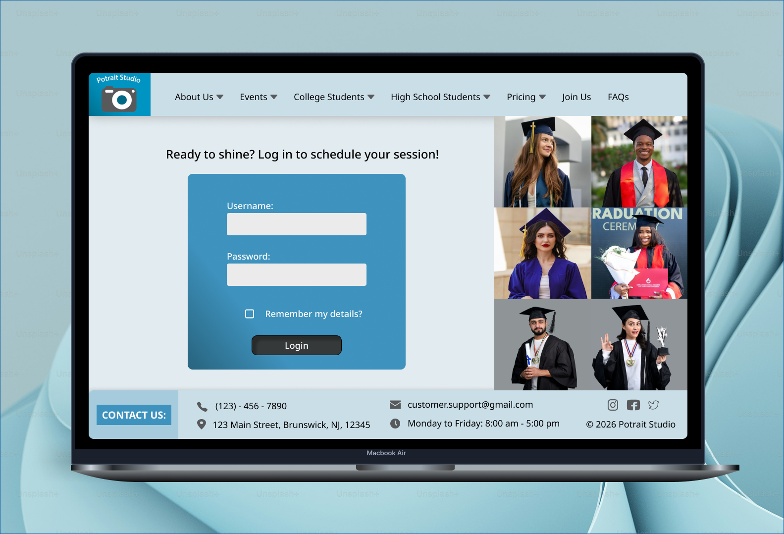
Original site screens from Lors Studio website (2026). Used for reference and analysis in this case study.
Before (Original Site)
After
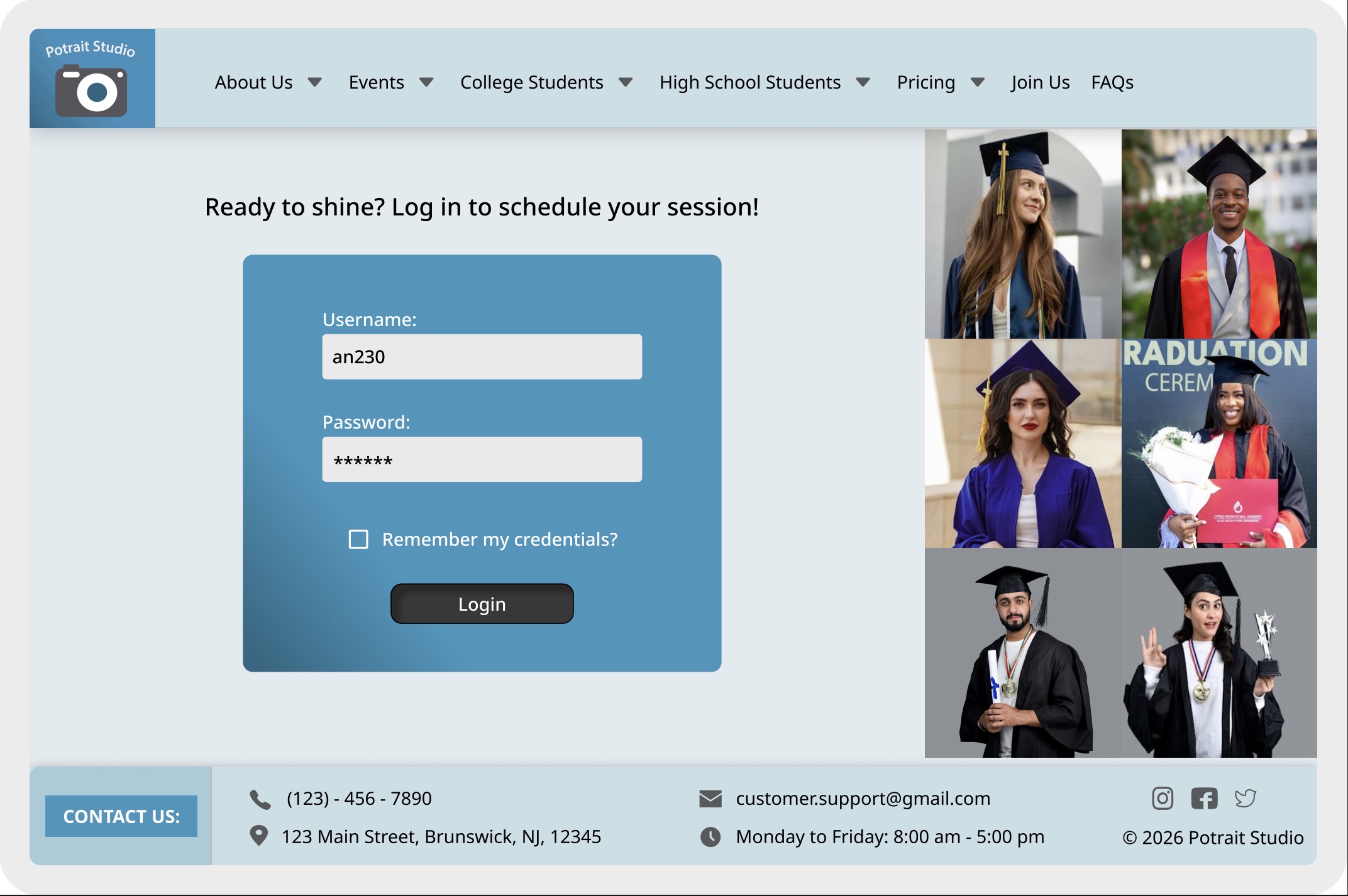
Changes made: Created a new logo/name using Adobe, added a header and footer to highlight key company information, incorporated graduation imagery, enhanced the visual design using brand colors, and introduced a “remember my credentials” option for future convenience.
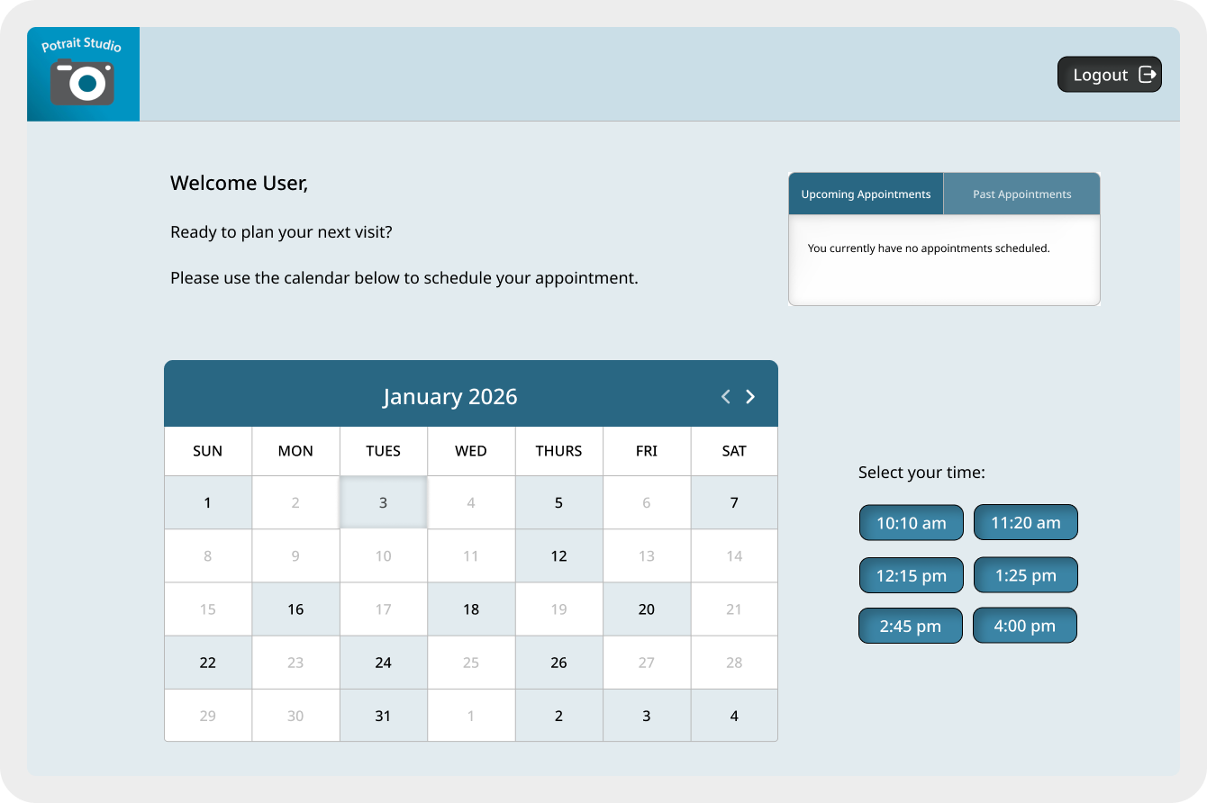
Changes made: Designed a table to display both upcoming and past appointments, developed a color-coded calendar to clearly highlight available dates and times—addressing a key pain point—and refined the design using brand colors.

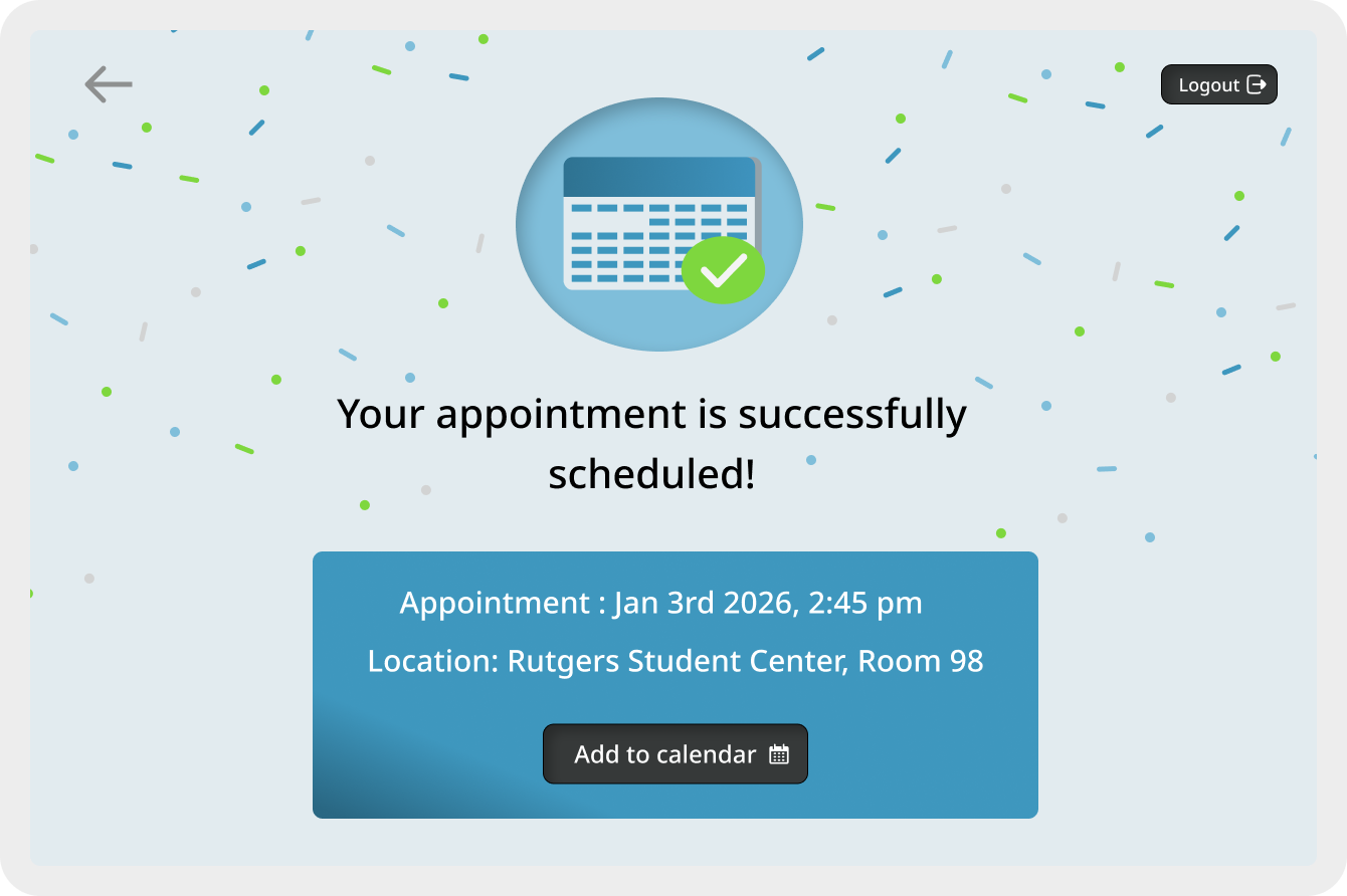
Changes made: Added a logout button for easy sign-out, an “Add to Calendar” button to set reminders, and confetti to make the page more exciting.
Others:
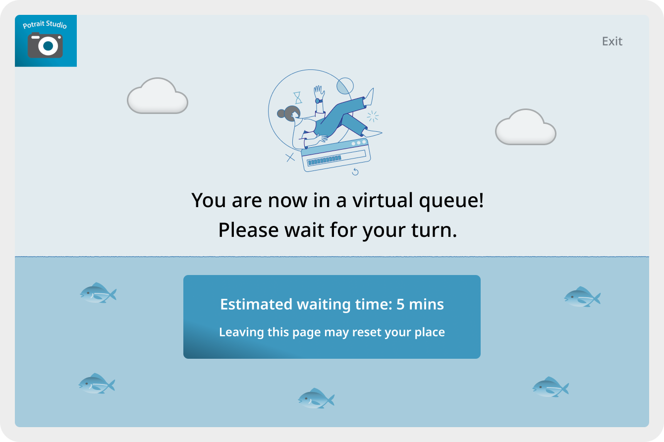
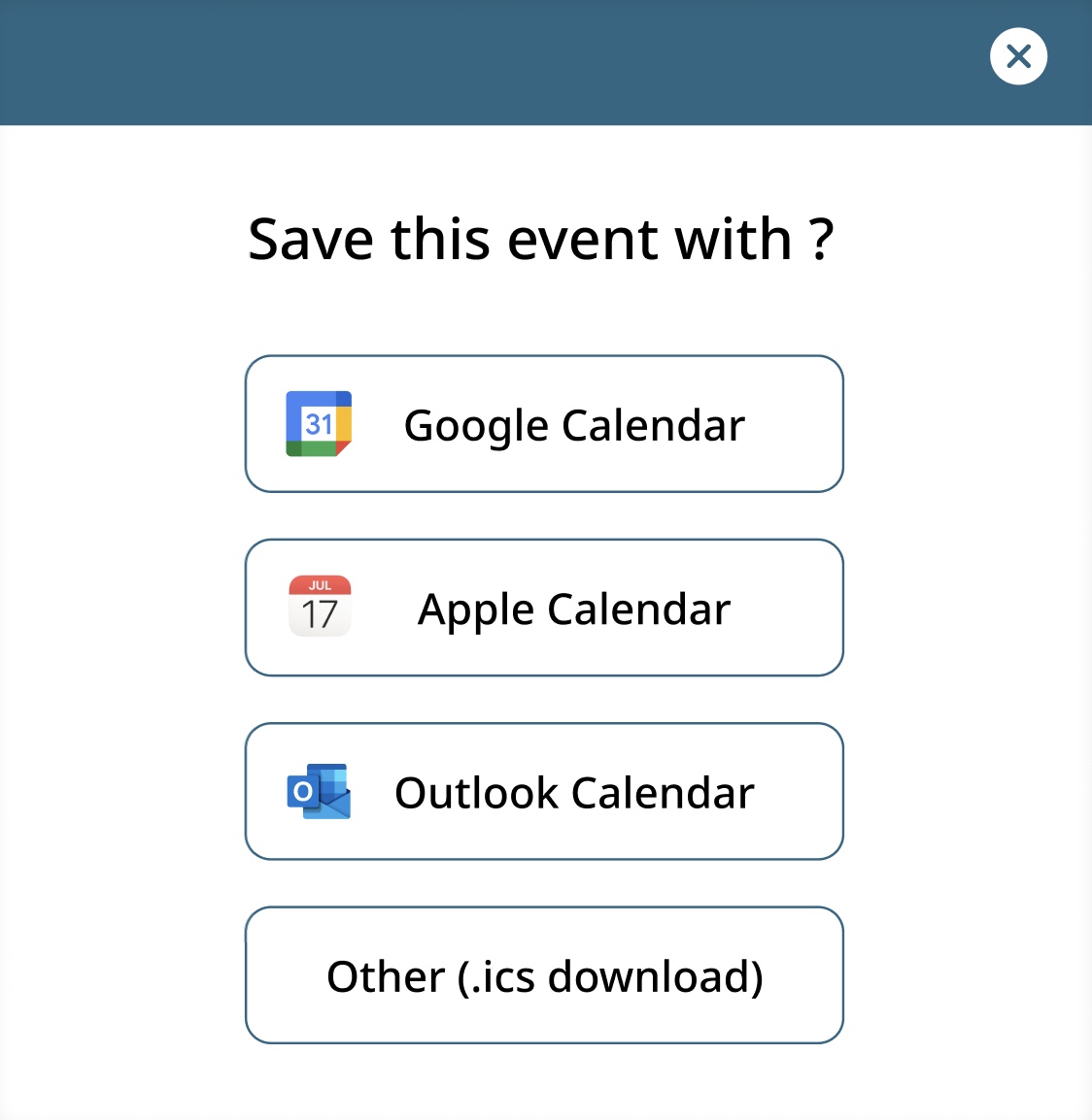
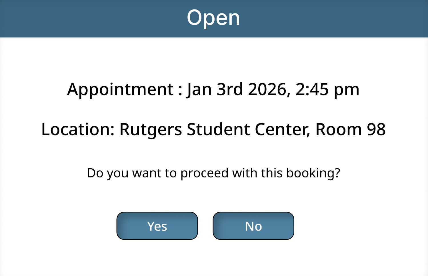
Designed a virtual queue page to guide users during high traffic. Created overlays to confirm appointment and save the event.
Prototype
This prototype showcases the redesigned booking flow, including overlays, the login page, the booking page, and the confirmation page.
User Testing
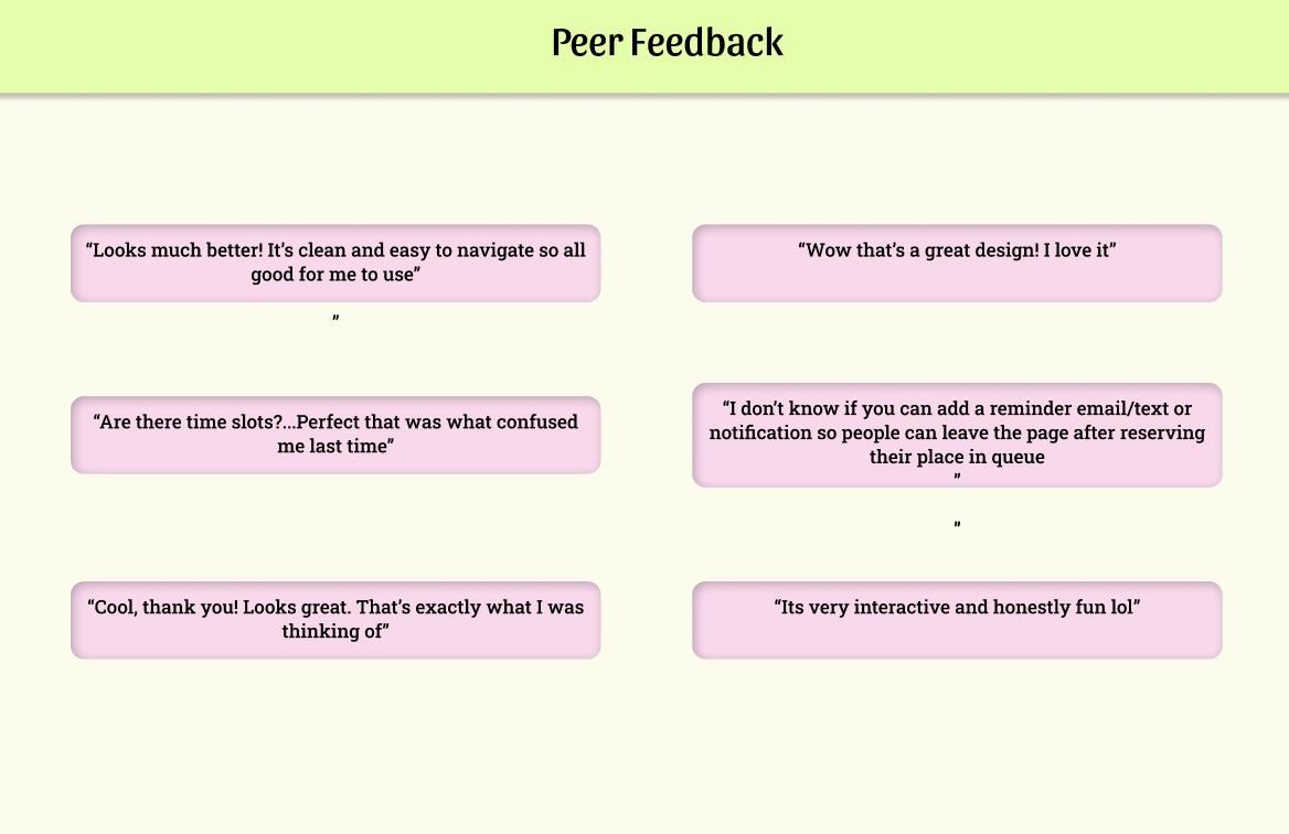
-
Rutgers users responded very positively to the redesign.
-
Users felt the designs effectively address their concerns.
-
One user suggested adding an option to reserve a spot in the queue—this issue should be explored in collaboration with the development team.
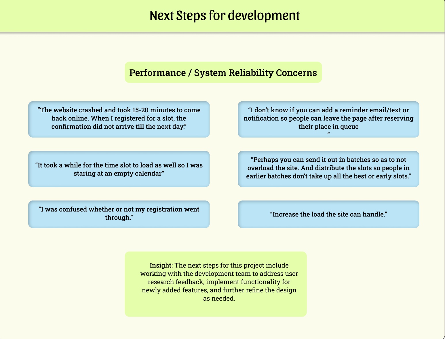
Next Steps
-
Technical insights gathered during the initial phase of user research will be shared with the development team.
-
These insights will guide the next phase of development.
-
The goal is to ensure the designs effectively address user needs while incorporating new feature functionality.